
Understand your dashboard
You know your way around the Content Menu; now read the page it opens on. Learn what every KPI card, chart, and feed on the Overview page is telling you.
Introduction
Your accounts are in and organized, so now you get to use them. The Overview Page is your home base in Socialpruf; the first screen you'll see when you log in, and a complete, at-a-glance snapshot of every account you're tracking; followers, engagement, content performance, demographics, and more, all in one place.
In this lesson you'll learn how to read the Overview Page and customize it to your workflow. The rest of this chapter turns it into a launchpad: filtering down to exactly what you care about, comparing entities head to head, benchmarking against past periods, and setting goals. Everything you'll do day-to-day in Socialpruf starts here.
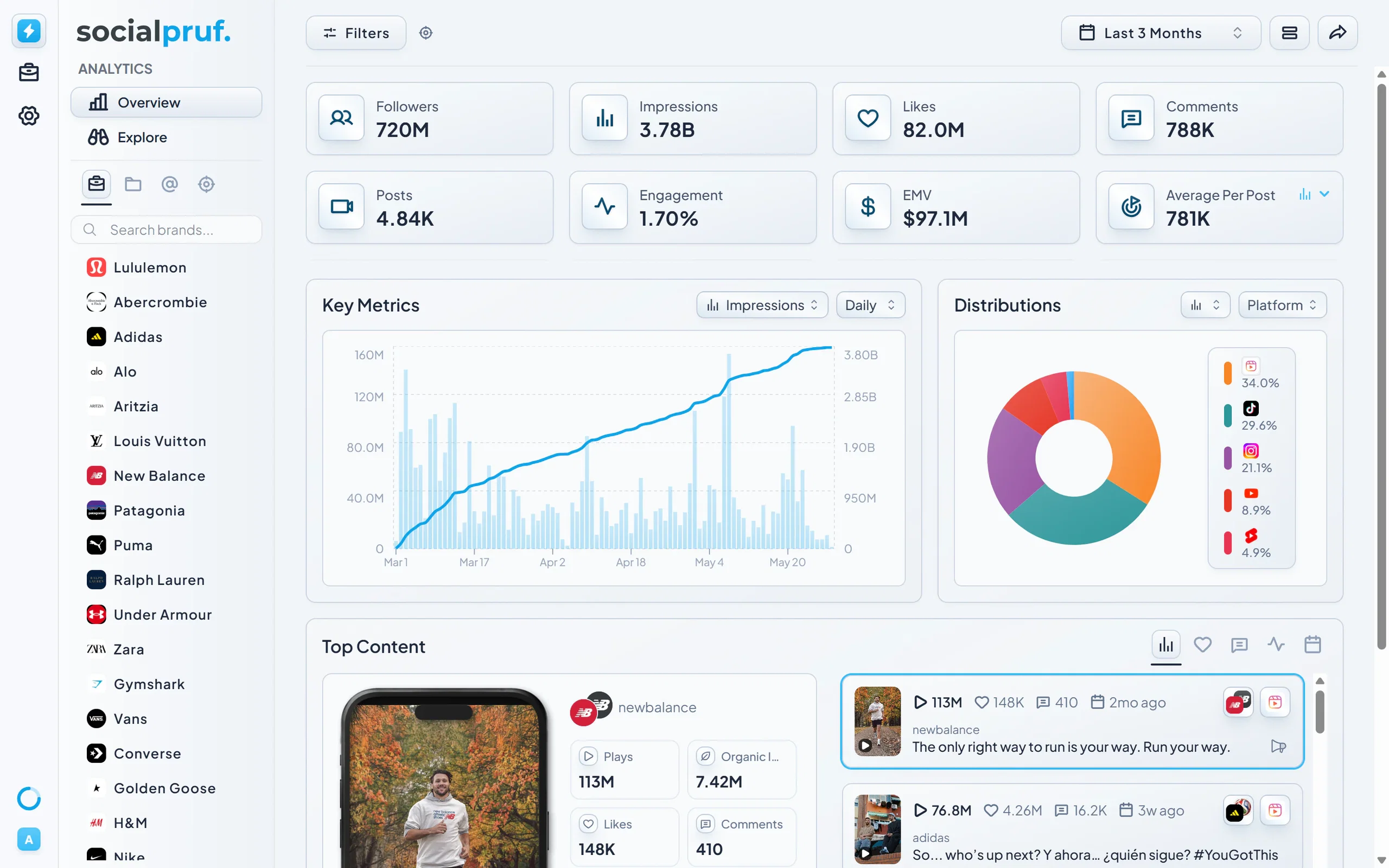
Understanding your KPI cards
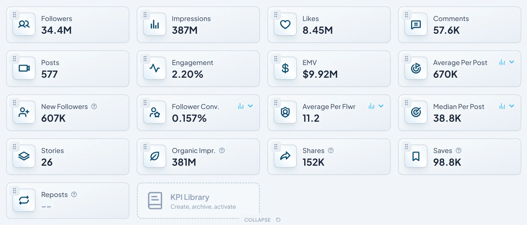
At the top of the Overview Page, you'll see eight key performance indicators (KPIs) displayed as cards. These give you the headline numbers across all the accounts you're tracking.
Expanding your KPI view
Click the Expand button below the KPI row to reveal additional metrics. When KPIs are expanded, you can drag and drop them into any order to customize your dashboard layout to match how you think about performance.
Drilling into a KPI
Most KPIs expand with more information. Click any card to open a detailed view or change the base KPI.
- Followers KPI: Clicking Followers opens the cumulative audience demographics for whichever accounts you have selected. You'll see:
- Audience distribution by country
- Breakdown by gender
- Breakdown by age group
- EMV (Earned Media Value) KPI: EMV is fully customizable to match your organization's valuation model. Click into the EMV card to:
- Set your own CPM rate
- Assign a monetary value to likes
- Assign a monetary value to comments
- Averaged KPIs: The blue chart icon on KPI cards opens a dropdown for you to choose which base KPI you want to average. You can average:
- Impressions
- Likes
- Comments
- EMV
- All other KPIs: Clicking most other KPI cards surfaces two things:
- Top-performing posts ranked by that specific metric.
- The virality distribution for your content relative to that KPI.
Pro tip: Take a few minutes to click through each KPI on day one. Each card hides a layer of context that explains why a number looks the way it does.
Charts & visual insights
Scroll below the KPI cards and you'll find two interactive charts.
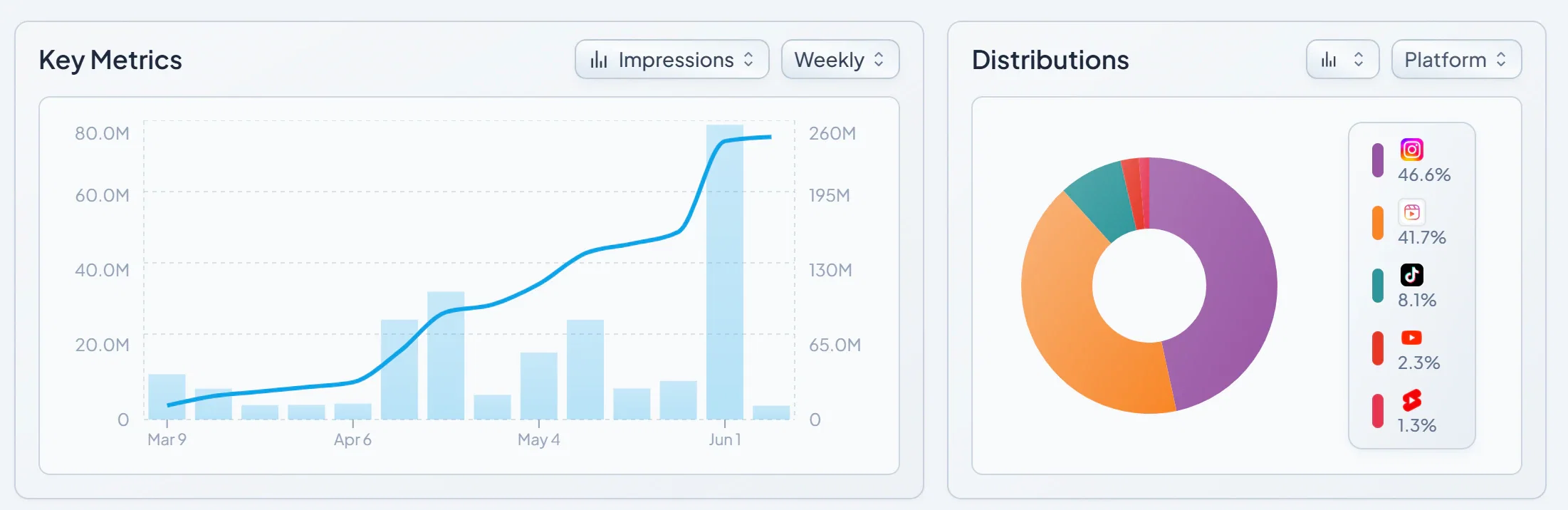
Key Metrics chart
The Key Metrics chart plots performance over time. You can:
- Filter between followers, impressions, engagement, EMV, and more.
- Adjust the date range to focus on the period that matters to you.
- Click any spike or data point to see the exact content driving the change.
- Click and drag across a section of the chart to get cumulative stats for that specific window.
Every piece of content surfaced is fully viewable and playable directly inside Socialpruf. You never need to leave the dashboard to review a post.
Distribution pie chart
The distribution chart breaks down your performance by category. Clicking any slice of the pie applies a filter to the top of the dashboard, instantly recalculating every chart and number on the page to reflect just that segment. You can sort the distribution by:
- Platform
- Brand
- Account
- Collaborator
- Mention
- Content
Pro tip: Use the pie chart as an exploration tool. If you see a slice that's outperforming the rest, click into it; you'll often uncover patterns about which platforms, content types, or accounts are pulling the most weight.
The Top Content feed
At the bottom of the Overview Page, you'll see the Top Content feed, a curated grid of your best-performing posts based on the filters you've applied.
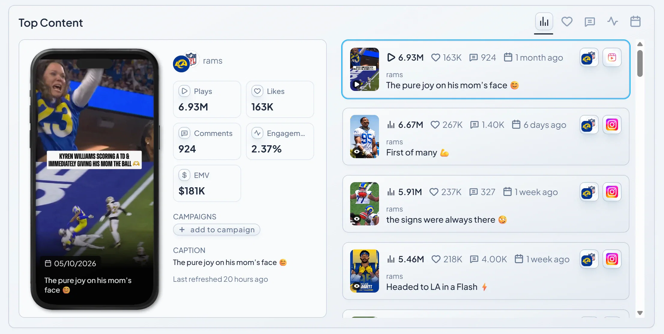
You can sort this feed by:
- Impressions
- Likes
- Comments
- Engagement rate
- Date
This section gives you a fast, visual answer to the question, “What's working right now?”
Switching to Table View
In the top right of the Overview Page, click the Table View icon to change the dashboard's orientation. Table View presents your data in a spreadsheet-style layout, which is ideal for side-by-side comparison and bulk analysis. The table view will either sort individual posts, brands, accounts or campaigns depending on your filter. Table view is especially useful for portfolios and brand comparison as you can click into each asset to view its filtered dash.
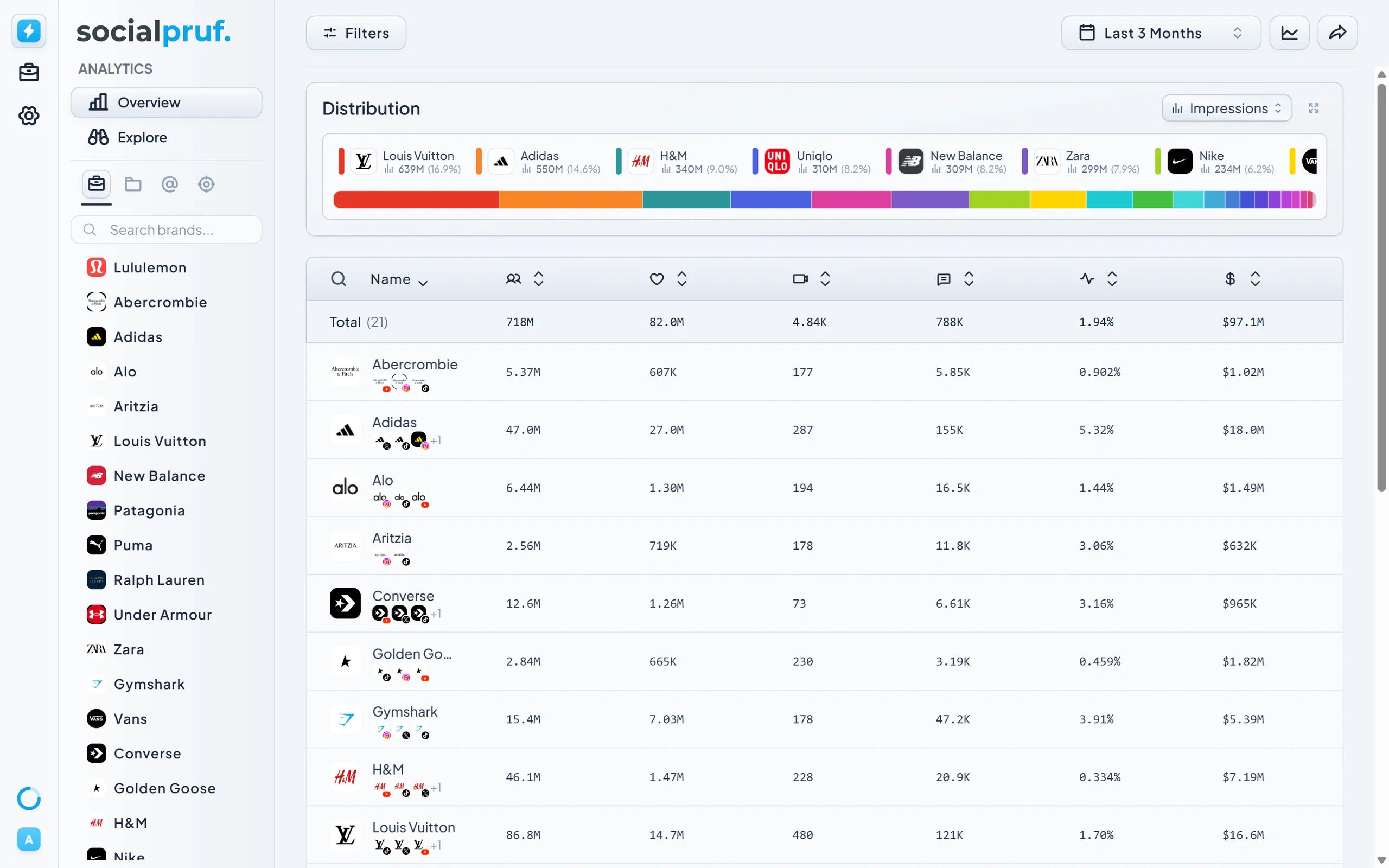
In Table View, you can:
- Filter by any KPI by clicking column headers at the top.
- Click into any account, brand, or campaign to drop into the original dashboard view for that entity.
- Expand the distribution insights at the top to see a multi-KPI overview across all the entities you've filtered.
Customizing your columns
Open the Settings tab above the table to:
- Choose which columns are visible
- Reorder columns to match your workflow
Your column layout is saved, so you'll see the same setup the next time you return. You can send your layout as a live report just the same as the overview.