

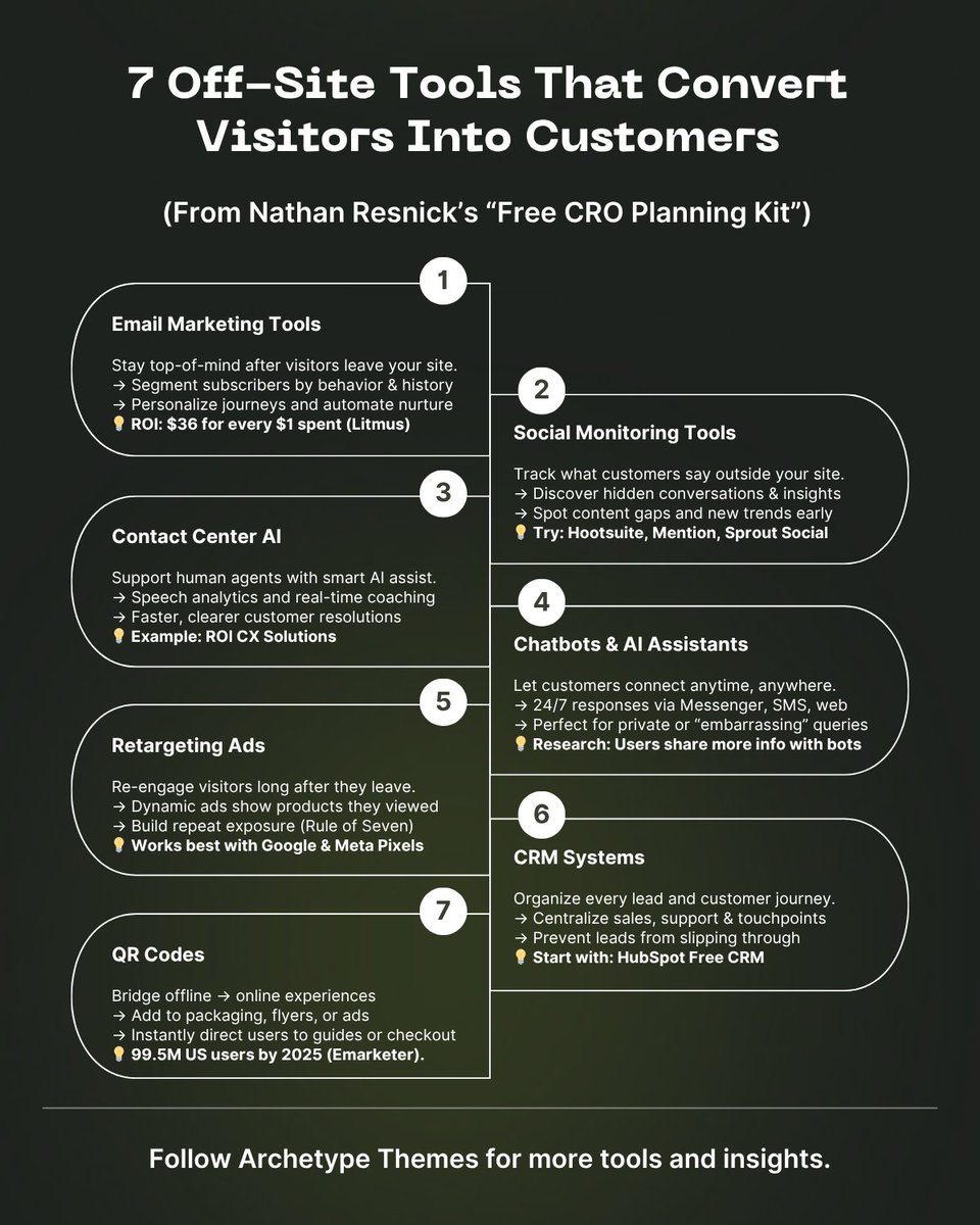
Key Metrics
Distributions


Canada Post to the US is now DDP only! As of August 29, 2025, all Canada Post shipments into the US must be sent Delivered Duties Paid (DDP). DDU labels are no longer accepted and will be blocked at creation. Here’s what this means for merchants: ✅ Duties must be prepaid; customers can’t pay at delivery ✅ Shopify duties calculations must be enabled to purchase labels ✅ Canada Post + Zonos integration supports duty pre-collection directly in Shopify To stay compliant, make sure you have: → Enabled duty collection for the US in Settings > Taxes > Duties → Added HS codes + Country of Origin to all products → Updated duties display in Markets > United States → Adjusted US shipping rates to reflect DDP costs → Confirmed your fulfillment partner can generate Canada Post DDP labels (or purchase labels in Shopify) If you haven’t updated your settings, you’ll need to act before your next US order. Alternatively, DHL Express or Purolator via Shopify Shipping remain options for DDU shipping. Learn more: t.co/2HqjLSQaZy Follow @ArchetypeThemes for more compliance and shipping updates.


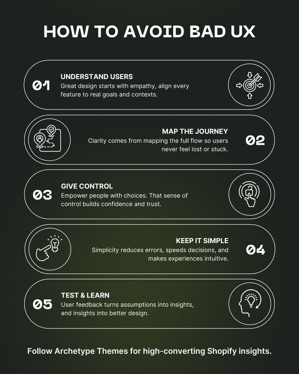
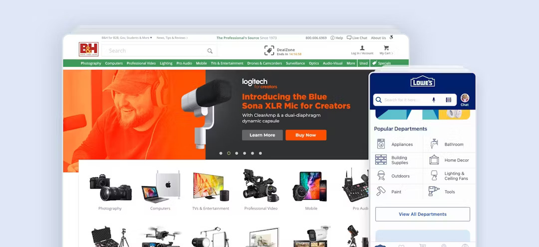
Most shoppers don’t leave because of price. Shoppers often leave because they can’t find what they want. Baymard’s 2025 benchmark shows 58% of desktop sites and 78% of mobile sites fail at Product List UX. That means cluttered catalogs, weak filters, and buyers giving up before checkout. Here are 8 fixes every ecom site should implement: 1/ Combine variations into one list item Don’t flood the list with duplicates. Instead, use swatches for colors and finishes. 2/ Show 3+ thumbnails per item Multiple views (cutout, lifestyle, and feature) help users decide without extra clicks. 3/ Include price per unit Clear comparisons, less math, faster decisions. 4/ Be cautious with horizontal filters They hide options and slow discovery. Use only for small sets. 5/ Enable multi-select filters Let users pick more than one size, color, or price range. 6/ Always include 5 essential filters Price, rating, color, size, and brand. 7/ Show applied filters clearly Quick remove and “clear all” to keep users in control. 8/ Offer the 4 essential sort types Price, rating, best sellers, and newest. For developers and merchants, these are low-lift theme changes that unlock higher discovery and higher conversion. Follow @ArchetypeThemes for more practical UX insights backed by research.


Baymard’s latest study shows that many generative AI tools for UX or CRO analysis reach only 50–75% accuracy, far below the level needed for commercial ecommerce sites, where a single wrong change can cut into revenue. Why does that matter? Small UX details move the biggest numbers. Thumbnails instead of dots for product images drove a 1% conversion lift. Adding estimated delivery dates in checkout cut cart abandonment by 0.5%. Duplicating the “Place Order” button added $10M in annual sales for one retailer. That’s why Baymard’s new UX-Ray 2.0 set a higher bar: 95% human-level accuracy across 39 research-based heuristics, built on 150,000+ hours of ecommerce UX studies and tested on 45 sites across multiple markets. The lesson: AI can accelerate reviews, but unless its accuracy is documented and above 95%, it’s not safe for production. Efficiency means nothing if it ships bad UX. At Archetype Themes, we share that philosophy. Every theme we design is grounded in tested, research-backed UX patterns, not AI guesses, so merchants can move fast and stay conversion-safe. 👉 Explore Archetype’s Shopify themes built on proven UX foundations. t.co/Oxa0YcUcxJ Read the full Baymard study here: t.co/VLNdypGYLJ

For developers maintaining Shopify themes, structuring CSS is half the battle. CSS Cascade Layers make it easier to manage legacy styles, a principle we apply across Archetype themes too. Here’s a practical walkthrough inspired by Victor Ayomipo’s Smashing Magazine guide 👇 1️⃣ Define your layer order Start by declaring it at the top of your stylesheet: (@)layer reset, base, layout, components, utilities; Later layers take higher priority. Add an animation layer if you want to separate keyframes. 2️⃣ Group styles by responsibility → reset: browser defaults like box-sizing and margin resets → base: global elements: body, typography, scrollbars → layout: overall structure and positioning → components: reusable parts like buttons, menus, logos → utilities: single-purpose helpers such as .noselect This modular structure keeps overrides intentional and easy to debug. 3️⃣ Reduce specificity before layering Replace #ids with .classes and remove redundant !important declarations. This ensures the cascade behaves predictably. 4️⃣ Keep media queries with their components Responsive styles should sit beside their base rules. It maintains context and consistent priority. 5️⃣ Handle !important carefully Important declarations inside earlier layers can override later ones. Minimize or refactor them to avoid confusion. 6️⃣ Know how unlayered CSS behaves Anything written outside a declared @layer has the highest priority. Use it sparingly. 7️⃣ Browser support Cascade Layers are supported by roughly 94 % of browsers, ready for production use. Refactoring CSS with Cascade Layers won’t fix everything overnight, but it gives your theme a scalable structure: clearer hierarchy, fewer conflicts, and easier long-term maintenance. Read the full breakdown here: t.co/uU18zFccjg Follow @ArchetypeThemes for more front-end insights, modern CSS practices, and developer-focused theme updates.

ARCHΞTYPE (@archetypethemes) X Stats & Analytics
ARCHΞTYPE (@archetypethemes) has 1.64K X followers with a 1.03% engagement rate over the past 12 months. Across 274 posts, ARCHΞTYPE received 2.03K total likes and 255K impressions, averaging 7.40 likes per post. This page tracks ARCHΞTYPE's performance metrics, top content, and engagement trends — updated daily.