NewClaim a free social report

instagram analytics
Similar Accounts:
instagram analytics
Similar Accounts:
followers
237K
impressions
7.91M
likes
306K
comments
5.95K
posts
655
engagement
1.23%
emv
$242K
Average per post
12.1K
Key Metrics
Impressions
monthly
Distributions
Content
146K
5.83K
51
3mo ago
thedieline
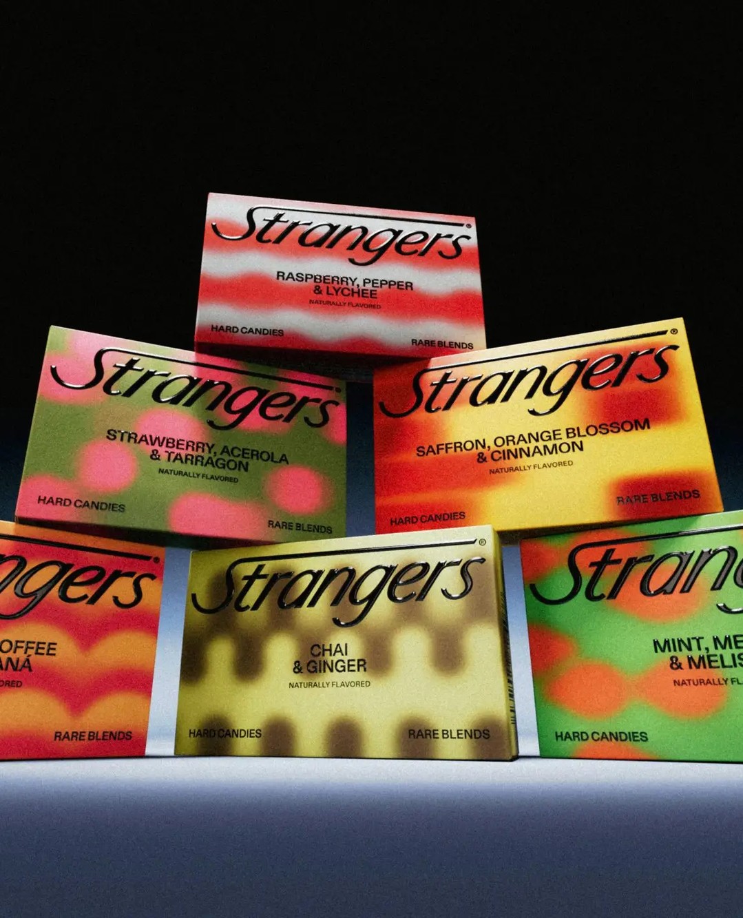
With Strangers Candies, the team at @auge_d builds a visual identity around curiosity and unpredictability. The typography is sharp with a slightly condensed structure, giving the name a confident presence.
The use of blurred and grainy patterns that sweep across each pack, almost like distorted digital textures or abstract heat maps, hints at the unexpected flavor combinations within. These visuals feel inspired by experimental print processes and glitch aesthetics.
Link in bio for the full article.
131K
5.23K
54
9mo ago
thedieline
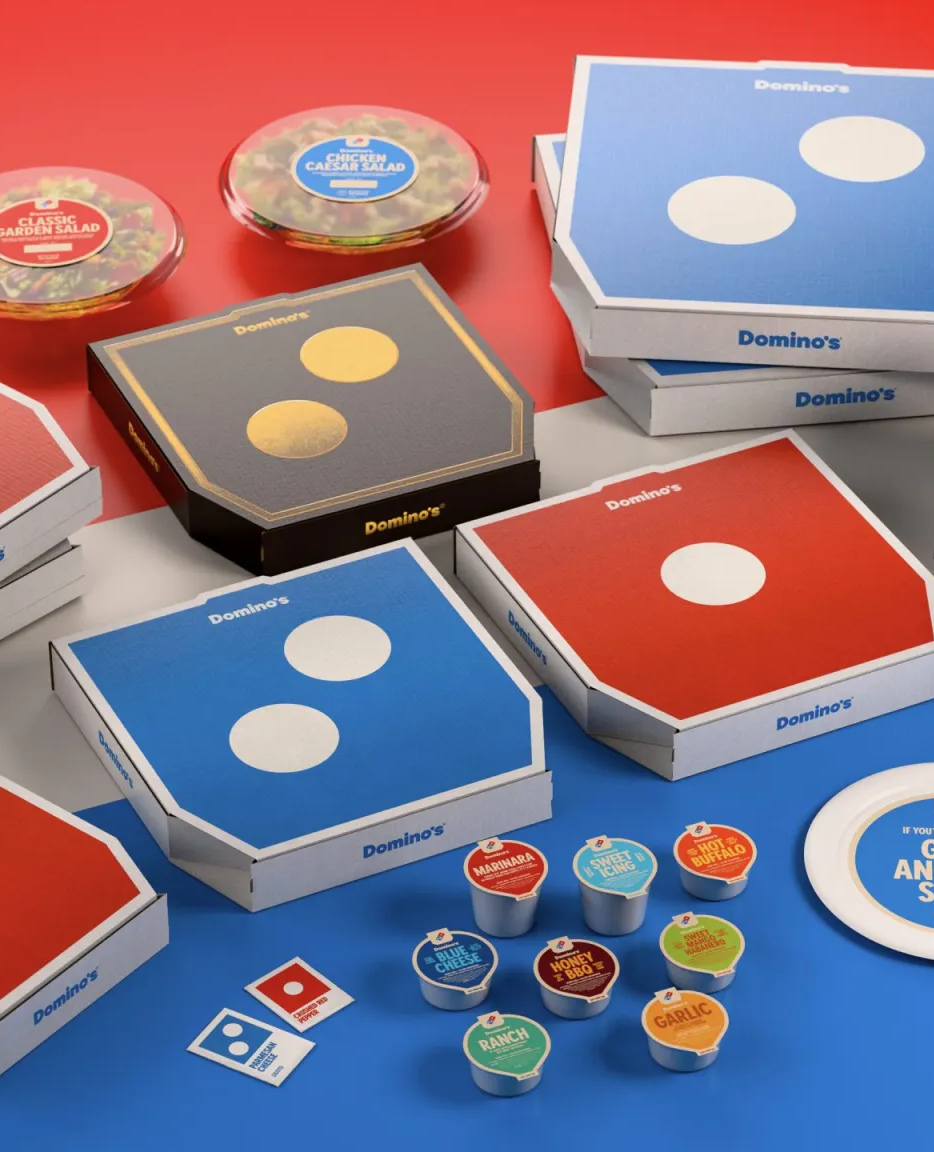
Domino's wants to get back to its roots and has just unveiled its first brand refresh in 13 years. Delivered courtesy of Boulder’s @wip_bdr, the new look is said to have taken inspiration from the past and present and showcased via a more contemporary identity.
Link in bio for the full article. #design #branding #linkinbio #graphicdesign #packagingdesign #thedieline #dieline #packaging
126K
5.03K
75
9mo ago
thedieline
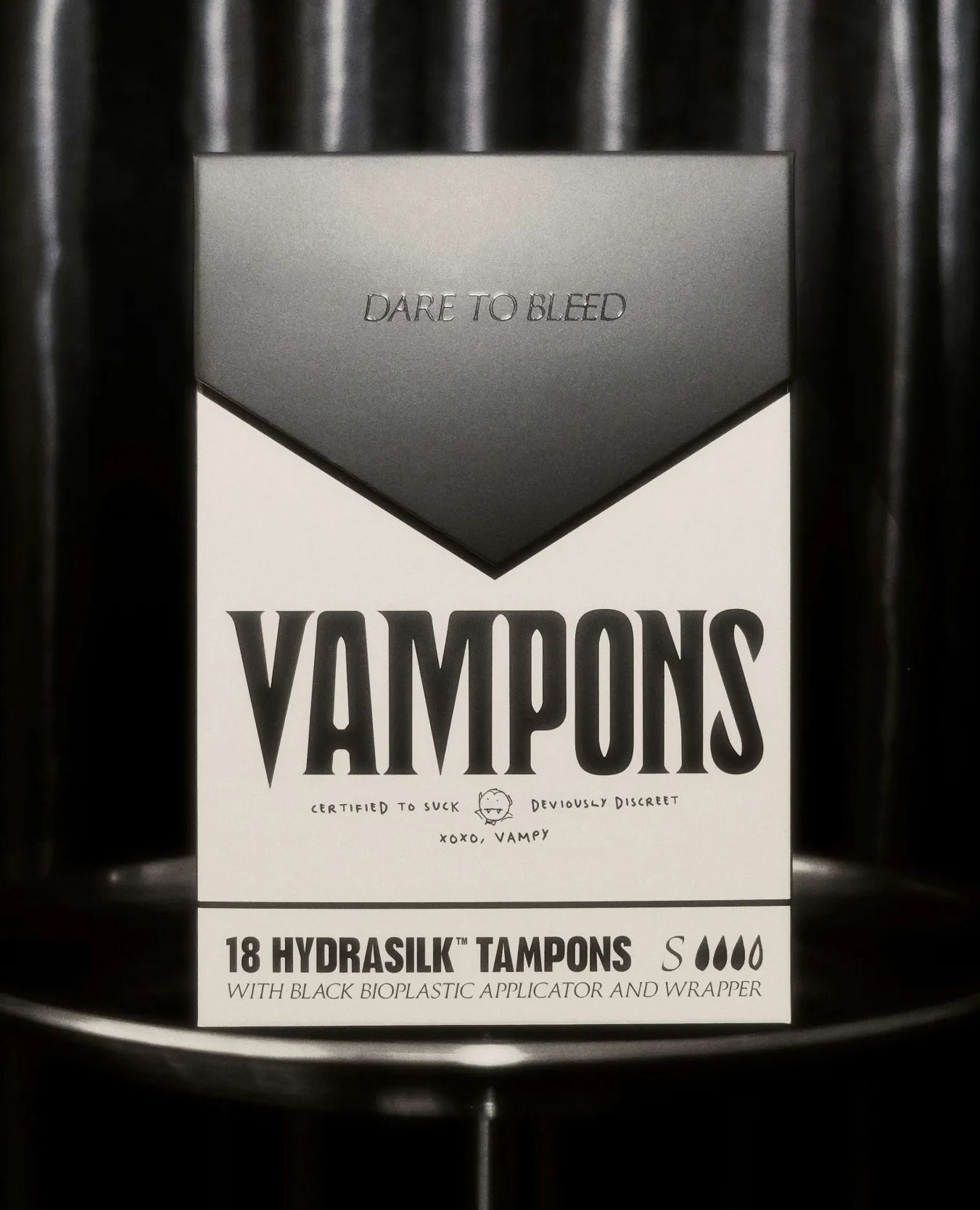
@vampons_rising , designed by @asweproceed.co, rethinks period care packaging with an aesthetic that shifts industry norms and breaks free from overused clichés within the women’s health space.
Rejecting the tired tropes of pastel colors, images of white women wearing all-white outfits, floral motifs, and overly pink cues, this design adopts a cigarette-style box while fully embracing the world of the undead who just so happen to have a taste for blood.
Link in bio for the full article. #design #branding #linkinbio #graphicdesign #packagingdesign #thedieline #dieline #packaging
120K
4.81K
29
7mo ago
thedieline
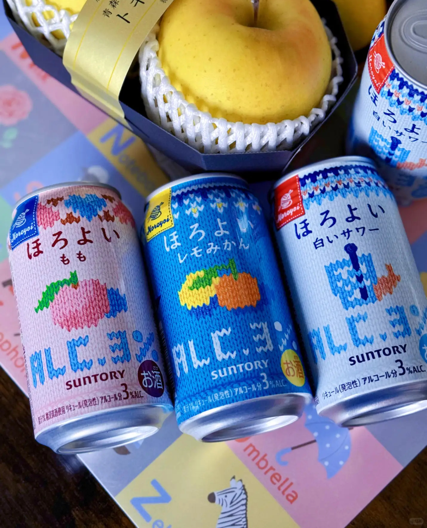
Suntory’s winter-limited Horoyoi cans lean straight into knitwear nostalgia, wrapping each flavor in graphics that mimic hand-stitched patterns. The typography looks almost as if embroidered, giving the cans a crafted, tactile presence despite being aluminum.
The fruit illustrations resemble pixelated sweater motifs you’d spot on a retro ski jumper, instantly setting the line apart from the minimalist gradients taking over the RTD aisle.
Link in bio for the full article. #design #branding #linkinbio #graphicdesign #packagingdesign #thedieline #dieline #packaging
79.9K
3.20K
87
4mo ago
thedieline
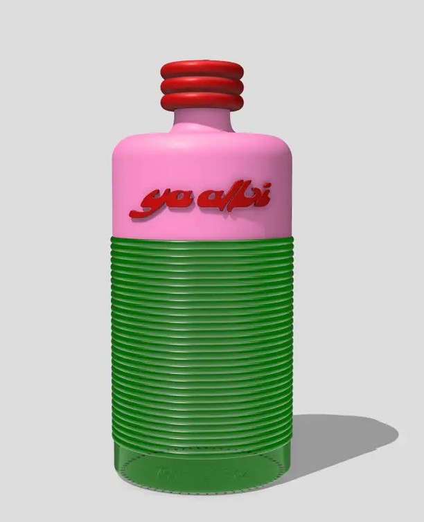
Palestinian olive oil brand @yaalbioil stands out in the olive oil category with a bold new bottle that serves as a love letter to Palestine.
Co-founder Yasmeen Abouremeleh has designed the new bottle to be timeless and sophisticated while standing out in the olive oil category.
Link in bio for the full article.
66.8K
2.67K
8
5mo ago
thedieline
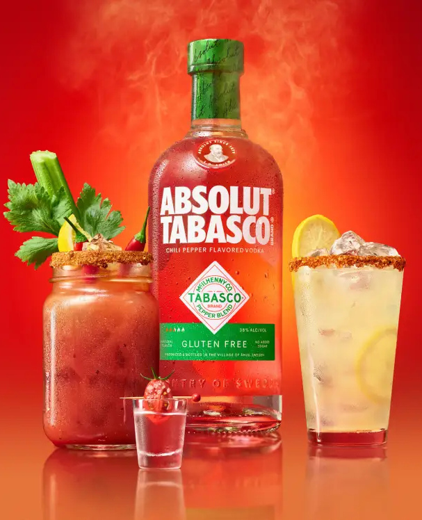
Tabasco is one of the most popular hot sauces in the world. The distinct flavor of its signature piquant red peppers has been used to add a spicy kick to food since 1868.
One of the reasons for Tabasco’s enduring popularity is its flavor’s versatility. Everything from pizza to eggs, seafood, and vegetables pairs well with Tabasco’s hot sauce. But now, Tabasco and Absolut are setting out to prove that even vodka is better with a touch of the Louisiana original.
Link in bio for the full article. #design #branding #linkinbio #graphicdesign #packagingdesign #thedieline #dieline #packaging
![[pt] Better Energy. Better Design.
PAZ®️ é a grande vencedora do Dieline Awards 2026 em Beverages. Vencemos o Best of Category, e pegamos o ouro em Functional Beverages. Muito obrigado @thedieline , time HardCuore e nossos parceiros de @paz_energy pela conquista. ⚡
[en] Better Energy. Better Design.
PAZ®️ is the big winner of the Dieline Awards 2026 in Beverages. We won Best of Category and took home Gold in Functional Beverages. Thank you so much @thedieline , the HardCuore team, and our @paz_energy partners for this achievement. ⚡](https://cdn.socialpruf.com/instagram/thumbnails/3891186767185217326_1800766458)
66.5K
368
32
2mo ago

thedieline
[pt] Better Energy. Better Design.
PAZ®️ é a grande vencedora do Dieline Awards 2026 em Beverages. Vencemos o Best of Category, e pegamos o ouro em Functional Beverages. Muito obrigado @thedieline , time HardCuore e nossos parceiros de @paz_energy pela conquista. ⚡
[en] Better Energy. Better Design.
PAZ®️ is the big winner of the Dieline Awards 2026 in Beverages. We won Best of Category and took home Gold in Functional Beverages. Thank you so much @thedieline , the HardCuore team, and our @paz_energy partners for this achievement. ⚡
59.6K
2.39K
25
7mo ago
thedieline
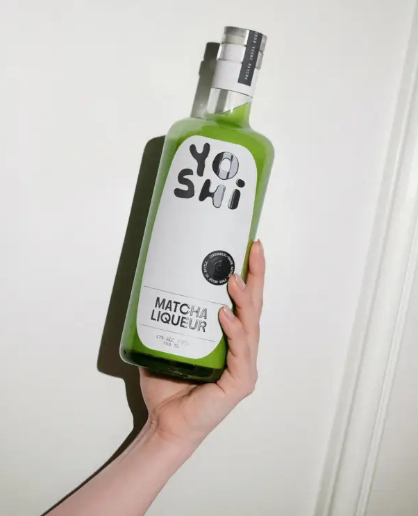
Yoshi’s packaging leans into an irreverent visual language that feels pulled from early streetwear graphics and 2000s import snack culture rather than the usual craft-liqueur cues.
@sainturbain builds the whole system around chunky, off-kilter letterforms that read like they were piped onto the label with icing, matcha-flavored, of course. When paired with ultra-minimal layouts and a bottle that allows the unmistakable green to shine through, it’s a smart detour from the category’s premium-heavy playbook, trading ornate detailing for something closer to a zine cover.
Link in bio for the full article. #design #branding #linkinbio #graphicdesign #packagingdesign #thedieline #dieline #packaging
55.4K
2.22K
119
11mo ago
thedieline
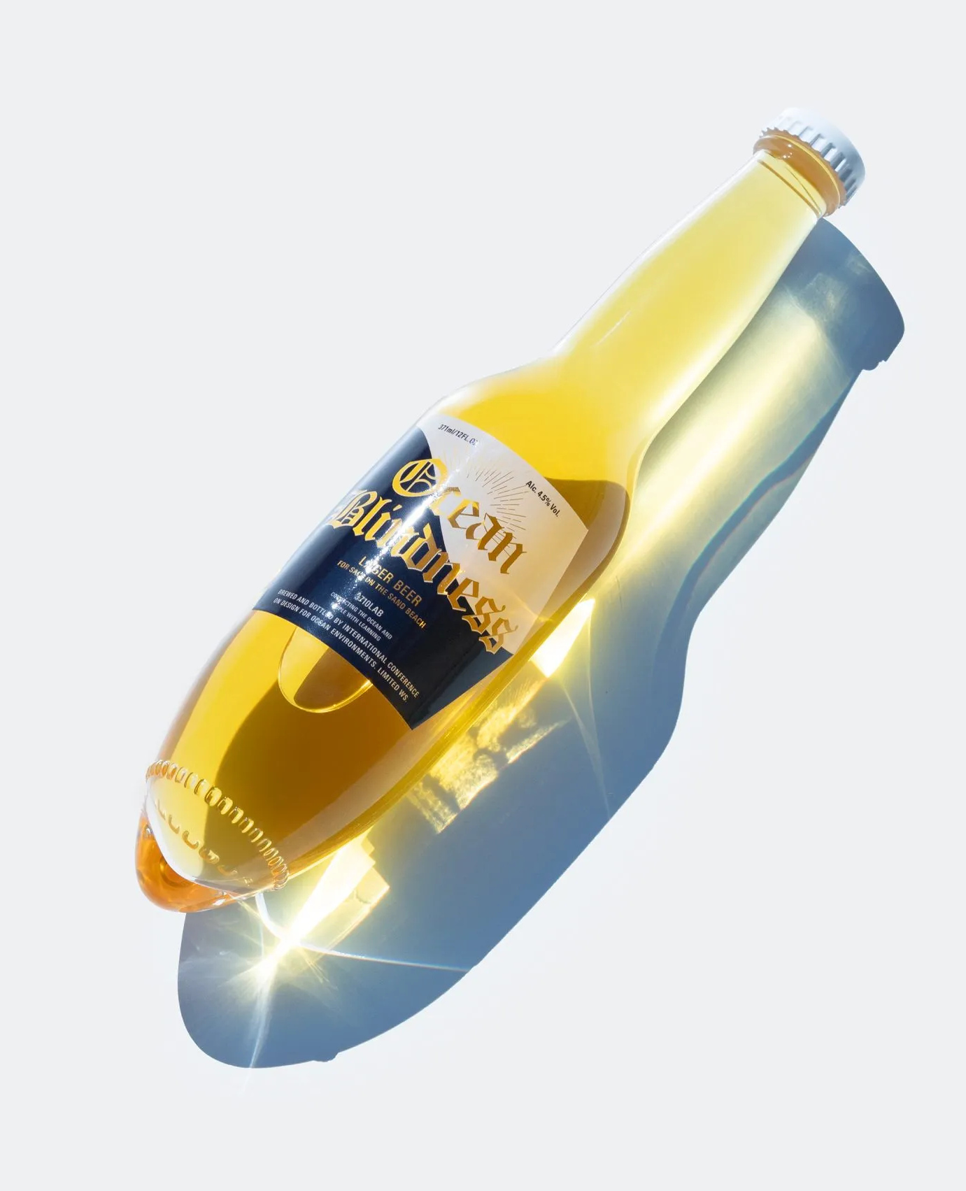
In 2023, Japanese design firm @kenji_abe_ devised a clever solution with a bottle design that can be easily placed in the sand. The "Ocean Blindness" appears to be a regular long-neck beer bottle, but with a slightly peaked and rounded bottom. The shape is almost torpedo-like, and it does seem to make it easier to shove the bottle into the sand.
But some folks aren't thinking about sandy beaches at the sight of Kenji Abe's bottle. Instead, they're thinking of places where the sun doesn't actually shine.
Link in bio for the full article. #design #branding #linkinbio #graphicdesign #packagingdesign #thedieline #dieline #packaging
51.8K
2.07K
28
1mo ago
thedieline
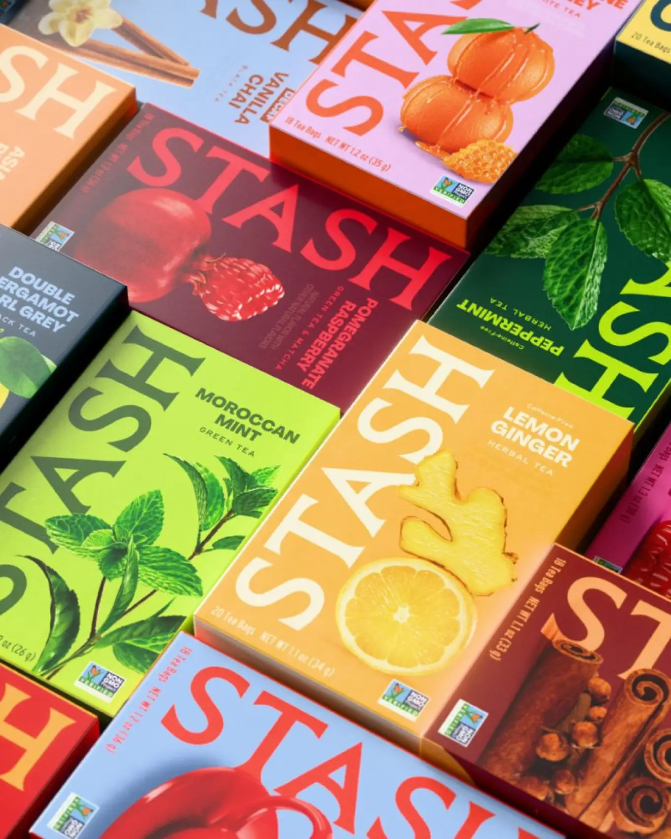
Los Angeles-based agency @hermanscheer refreshes the packaging and identity for the tea brand Stash. The new look emphasizes bold flavor, making functionality and natural elements secondary.
Link in bio for the full article.
50.9K
116
2
1w ago
thedieline
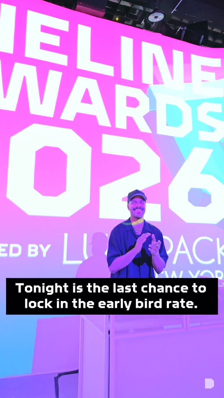
TONIGHT — Early Bird closes for the DIELINE Awards 2027 at midnight PST. ⏰
Just by entering, your project gets reviewed by our editors for editorial coverage on DIELINE.
What happens when you win?
→ Your work reaches millions of readers
→ Becomes a permanent part of design history
→ Advances straight to the iF DESIGN AWARD 2027
Three tiers. Three accessible rates — for agencies, independents, and the next generation.
After tonight, every rate rises.
Enter now → dielineawards.com
.
.
.
#packagingdesign #branddesigners #cpg #design #branding
50.0K
2.00K
26
2mo ago
thedieline
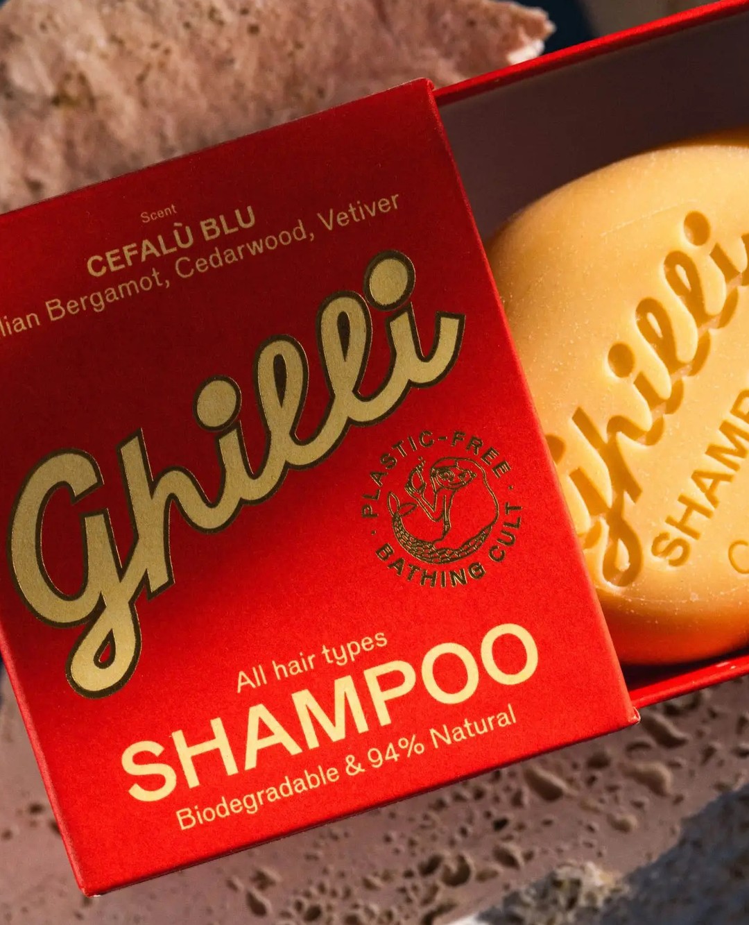
Solid bar soap is having a full cultural renaissance right now, moving from an afterthought at the back of the shower to something people are actively seeking out and proudly displaying, and Ghilli, a Zurich-based beauty start-up designed by Swiss studio allink, has created the box that makes that shift feel completely inevitable.
The color system alone is worth stopping for, with rich Campari red, dusty sage green, and soft powder blue sitting together like a Mediterranean market stall. Each shade evokes coastal geography, sun-warmed terracotta walls, sea-bleached shutters, and olive groves in the late afternoon.
Link in bio for the full article.
49.8K
1.99K
12
5mo ago
thedieline
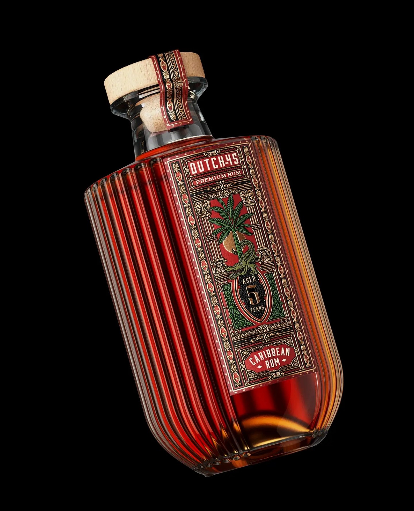
Dutch 45 Premium Rum packaging by @thinkboldstudio leans into opulence. The fluted glass looks like Art Deco decanters, while the typography is ornamental, borrowing from late nineteenth century label engraving.
The palette of oxblood red, deep green, and antique gold suggests tropical botany and aged spirits. Illustrated palms and reptilian motifs nod to Caribbean colonial trade imagery, rendered with old-world print precision. Compared to minimalist rum competitors, this design embraces maximal detail and material richness as a mark of confidence.
Link in bio for the full article. #design #branding #linkinbio #graphicdesign #packagingdesign #thedieline #dieline #packaging
49.5K
1.98K
17
11mo ago
thedieline
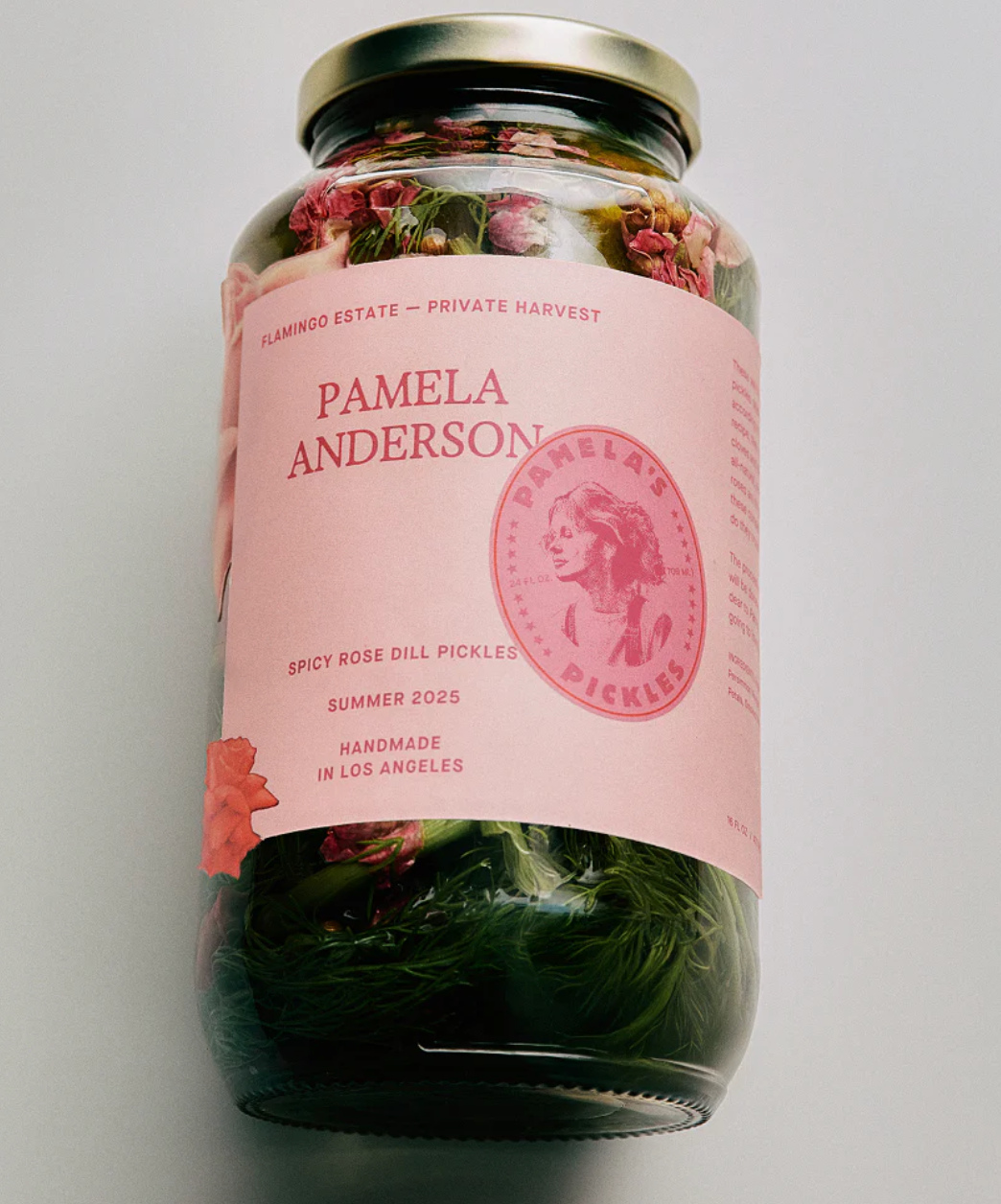
@flamingo_estate’s collaboration with @pamelaanderson on the Spicy Rose Dill Pickles nails a kind of high-design whimsy but without losing the brand’s known simplicity.
The jar’s blush-pink label wraps almost entirely around, broken only by a bright pink, all-caps serif type treatment of Anderson’s name. A circular seal featuring her profile, paired with “Pamela’s Pickles” in bold, acts as both logo and icon. Small details, like the rose illustration at the label’s edge, anchor it in the product’s handmade narrative.
Link in bio for the full article. #design #branding #linkinbio #graphicdesign #packagingdesign #thedieline #dieline #packaging
46.1K
1.84K
8
9mo ago
thedieline
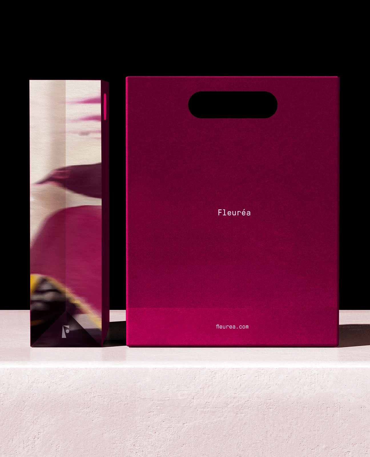
Fleuréa’s packaging by @lentildesignstudio leans into a sense of quiet drama. The deep berry-toned boxes are paired with blurred, almost ethereal floral imagery. Minimal sans-serif typography sits delicately on the front, giving breathing room to the saturated colors and abstract visuals.
The design balances structure and softness. One side is all color and type, the other an immersive bloom. Together, it creates a sensorial experience before you even open the box, perfectly aligning with the product’s airy, fragrance-forward concept.
Link in bio for the full article. #design #branding #linkinbio #graphicdesign #packagingdesign #thedieline #dieline #packaging
44.2K
1.77K
16
3mo ago
thedieline
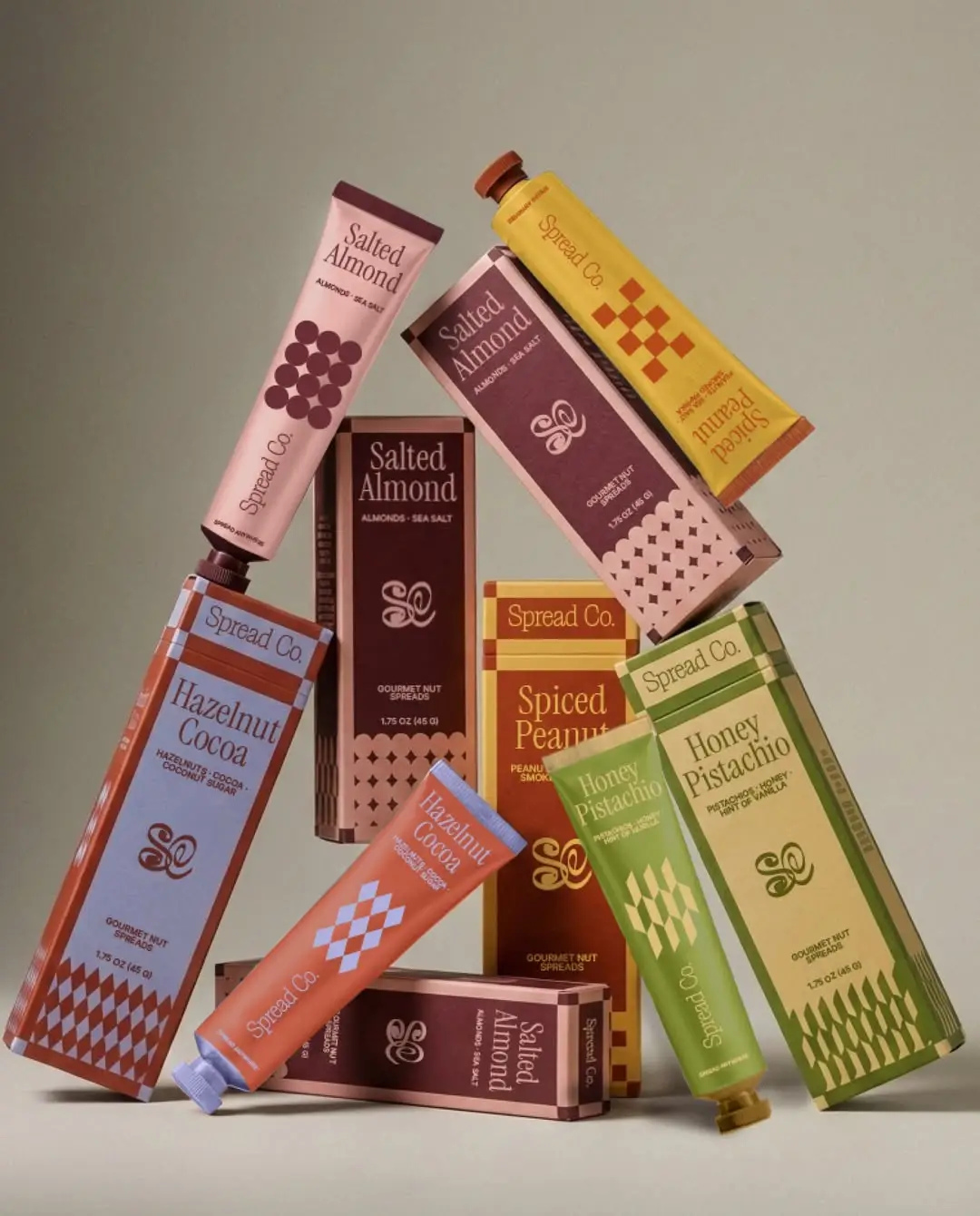
With Spread Co., the concept created by Atheria Studio explores what happens when gourmet nut spreads move from the traditional jar into aluminum tubes.
The shift feels perfectly timed as more brands experiment with this format, including recent examples like The Honey Department. Visually, the design pairs this modern format with a refined graphic language built around rich color blocks, vintage-inspired serif typography, and small repeating geometric patterns that echo classic confectionery and European pantry packaging.
Link in bio for the full article.
44.2K
1.77K
16
5mo ago
thedieline
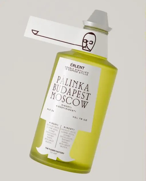
The squat bottle and horizontal neck tag look like industrial seals and archival labeling instead of a folkloric ornament. Evgeniya Tsoy’s concept packaging for the fruit vodka PÁLINKA pairs a crisp serif typeface with interesting spacing.
The colors move from oxidized reds to apple greens, mapping fruit character and maturation, while the minimalist line illustration makes the category look intellectual, not rustic.
Link in bio for the full article. #design #branding #linkinbio #graphicdesign #packagingdesign #thedieline #dieline #packaging
42.6K
1.71K
14
3w ago
thedieline
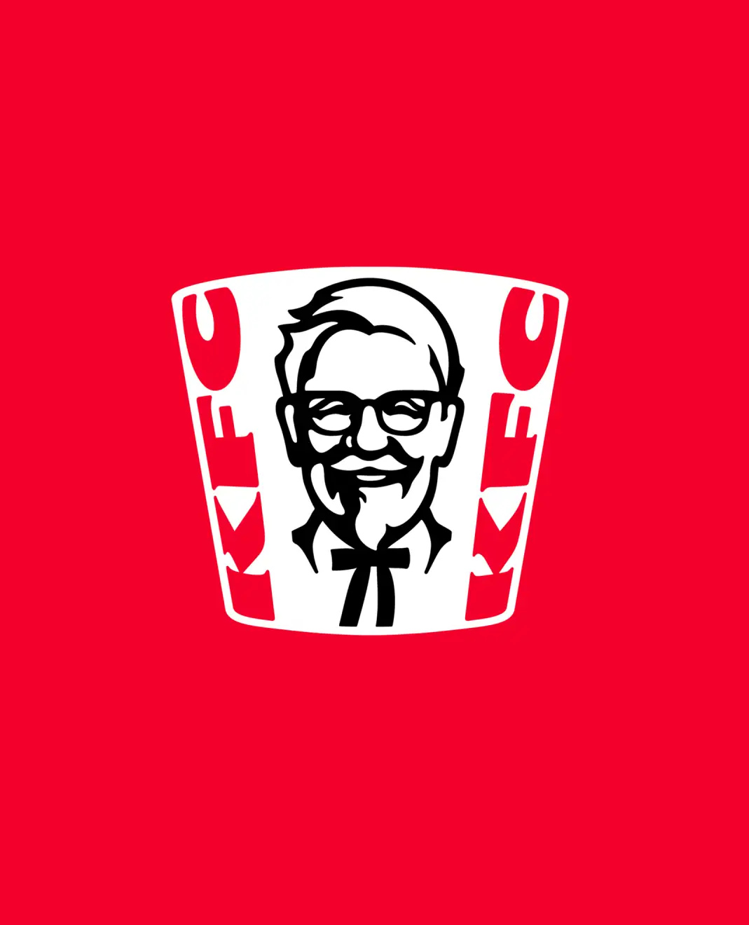
Today, KFC announced a global overhaul, developed with global branding agency @jkrglobal, spanning menu innovation, restaurant redesign, and a visual identity evolution, rolling out first across the UK and Ireland.
The finger-lickin ‘ good chicken brand is expanding its boneless chicken offerings under two banners: “Dipped,” a customizable tender-and-sauce format drawing from a library of 20-plus globally inspired sauces, and “Dunked,” a sauce-drenched format already performing in South Africa and India
Link in bio for the full article.
40.6K
372
10
3mo ago
thedieline
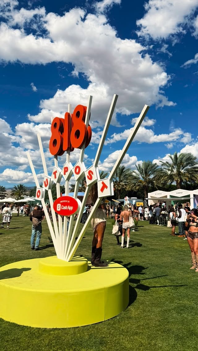
Inside 818 Outpost, where the brand world was just as compelling as the guest list.
A very cool, highly interactive branded experience from @drink818, presented by @cashapp, with standout moments from @lemme, @khloudfoods, @drinksprinter, @saltandstone, @youthtothepeople, @kyliecosmetics, @fruitriot, @postmates, @drinkupdate, @loopsbeauty, @khloudfoods, @rhode and more. From product sampling to immersive photo moments and thoughtful brand touchpoints throughout, the 818 Outpost team did an incredible job making the experience feel cohesive, social, and a genuinely smart way to bring so many incredible brands together. #packaging #packagingdesign #coachella #coachella2026 #branding
40.3K
1.61K
40
8mo ago
thedieline
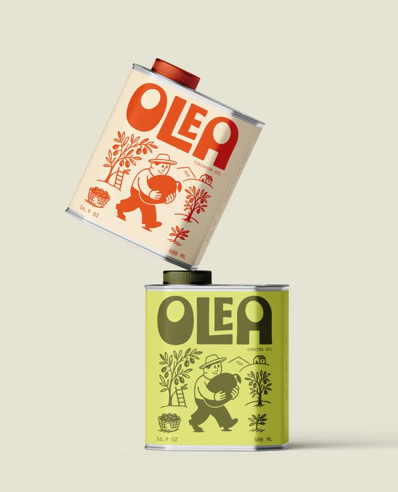
Olea’s packaging, designed by Ali Arshad, keeps olive oil fun and lighthearted. The sturdy tin cans feature oversized blocky type paired with cheerful illustrations of a farmer mid-harvest, giving the brand an instantly recognizable personality. Each SKU leans on a tight, earthy color palette and rust for finishing oil, green for cooking oil.
Link in bio for the full article. #design #branding #linkinbio #graphicdesign #packagingdesign #thedieline #dieline #packaging
Dieline (@thedieline) Instagram Stats & Analytics
Dieline (@thedieline) has 237K Instagram followers with a 1.23% engagement rate over the past 12 months. Across 655 posts, Dieline received 306K total likes and 375K impressions, averaging 467 likes per post. This page tracks Dieline's performance metrics, top content, and engagement trends — updated daily.
Dieline (@thedieline) Instagram Analytics FAQ
How many Instagram followers does Dieline have?+
Dieline (@thedieline) has 237K Instagram followers as of July 2026.
What is Dieline's Instagram engagement rate?+
Dieline's Instagram engagement rate is 1.23% over the last 12 months, based on 655 posts.
How many likes does Dieline get on Instagram?+
Dieline received 306K total likes across 655 posts in the last 12 months, averaging 467 likes per post.
How many Instagram impressions does Dieline get?+
Dieline's Instagram content generated 375K total impressions over the last 12 months.