NewClaim a free social report
instagram analytics
Similar Accounts:
instagram analytics
Similar Accounts:
followers
107K
impressions
34.1M
likes
1.56M
comments
20.0K
posts
149
engagement
5.54%
emv
$1.10M
Average per post
229K
Key Metrics
Impressions
monthly
Distributions
Content
6.31M
358K
1.45K
10mo ago

brandinquirer
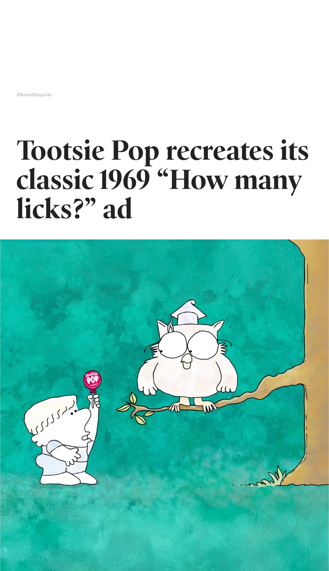
How many licks?
Tootsie Pop, the brand behind the only lollipop with a @tootsieroll center, has remade its classic Mr. Owl “How many licks?” commercial frame by frame with refreshed animation and new voice talent (no AI!).
The spot was redrawn by the acclaimed animation house @calabashanimation led by the Chicago-based creative team at @schafercondoncarter
Originally created by ad agency Doner, the 1969 spot is one of the most recognizable and longest-running television commercials to remain unchanged. The ad made the question an iconic part of the brand and pop culture, while cementing Mr. Owl as Tootsie Pop’s mascot.
With the remake, Tootsie Pop aims to introduce Mr. Owl to a new generation while giving longtime fans a nostalgic smile.
#Branding #GraphicDesign #DesignInspiration #advertising #tootsieroll #tootsiepop #mrowl #commercial
2.78M
111K
896
4mo ago
brandinquirer
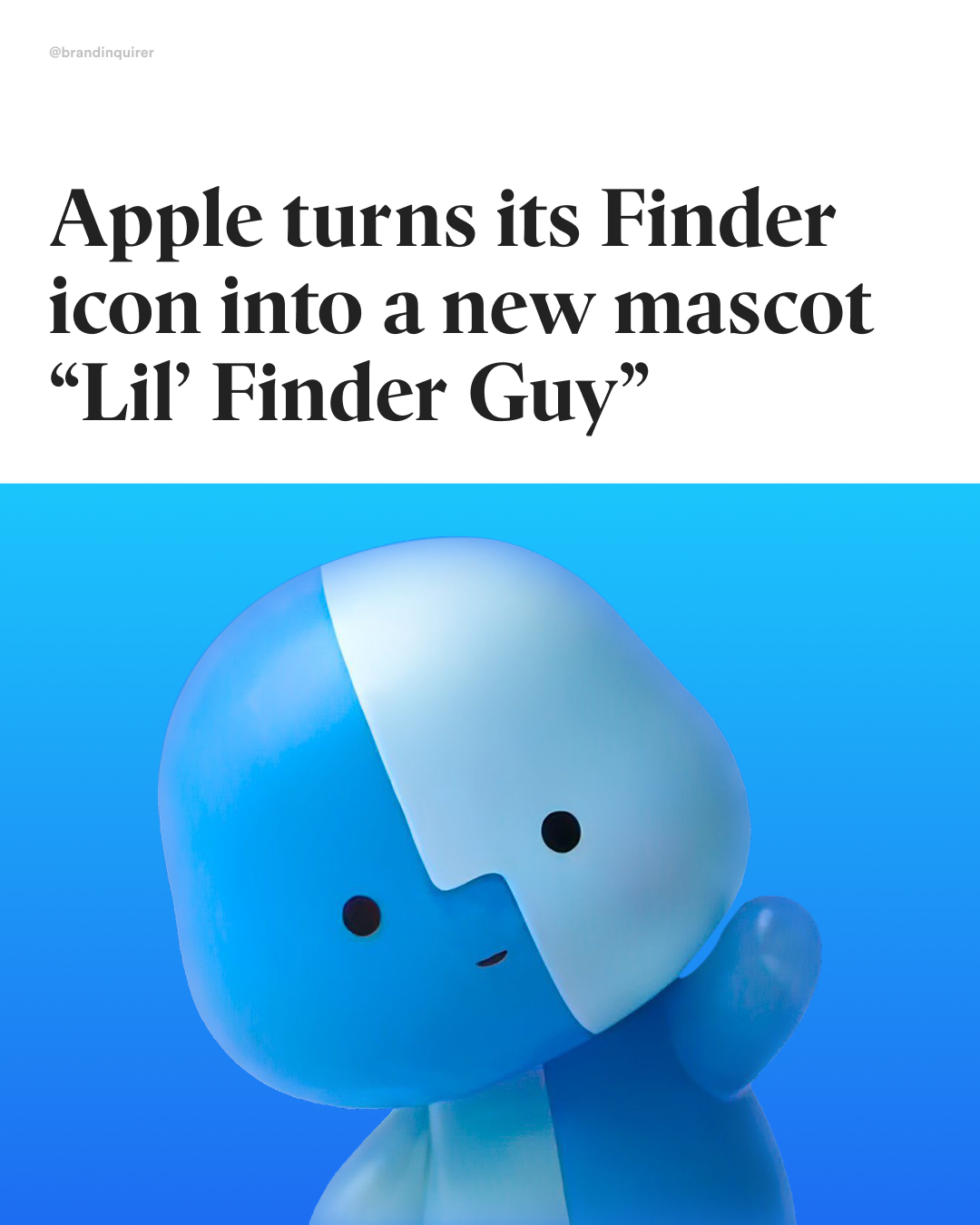
Apple’s new mascot? 🥹
@apple has turned its iconic two-tone Finder icon into a character fans are calling “Lil’ Finder Guy.”
The tiny, cute mascot briefly appeared in promotional TikTok posts and a livestream for the new MacBook Neo, and with only two appearances it has quickly become an online sensation.
The overnight love for Lil’ Finder Guy has sparked fan-made illustrations like @thebasicappleguy’s, 3D print models like @arielstudio_o’s, memes, and calls for Apple to release merchandise.
While not officially confirmed as a brand mascot or official name, “Lil’ Finder Guy” could become Apple’s second unofficial mascot, following Clarus the Dogcow.
Clarus began life as a bitmapped Cairo font image designed by Susan Kare in 1983 and was later used in the classic Mac OS Page Setup dialog to demonstrate page orientation; over time it became a beloved symbol among Apple developers.
#LilFinderGuy #AppleDesign #MacOS #apple #macbookneo #macbook #branding #graphicdesign #visualidentitydesign #characterdesign #mascot #mascotdesign
2.32M
92.9K
655
9mo ago
brandinquirer
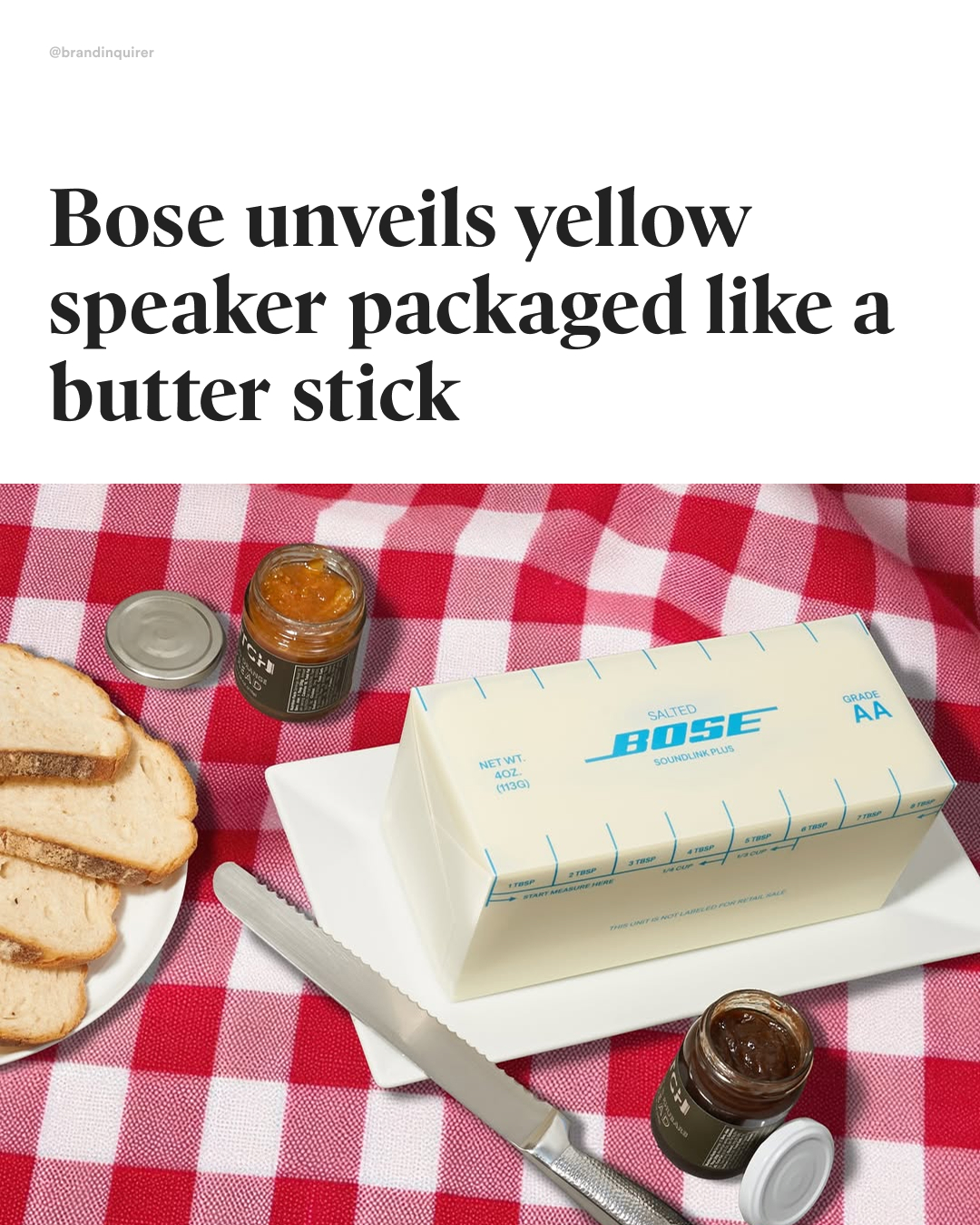
Sizzling design? 🧈
For the launch of @bose’s SoundLink Plus in its new Citrus Yellow, @cnc_merch and @cncexperiences created a limited-edition PR kit that reimagined the speaker as a stick of butter.
“Butter Yellow” has been called one of the hottest colors of 2025—spotted in interior design by Vogue, celebrated in Forbes and Harper’s Bazaar for dominating fashion runways and red carpets (think Timothée Chalamet at the Oscars), and embraced on tour by Sabrina Carpenter.
While the butter packaging won’t hit stores, you can still tap into the trend by getting the Citrus Yellow speaker in its standard box at bose.com.
#branding #brandidentity #logodesign #graphicdesign #creativedirection #brandstrategy #packaging #packagingdesign #branddesign #designinspiration #brandinspo #graphicdesigner #bose
2.25M
129K
861
9mo ago
brandinquirer
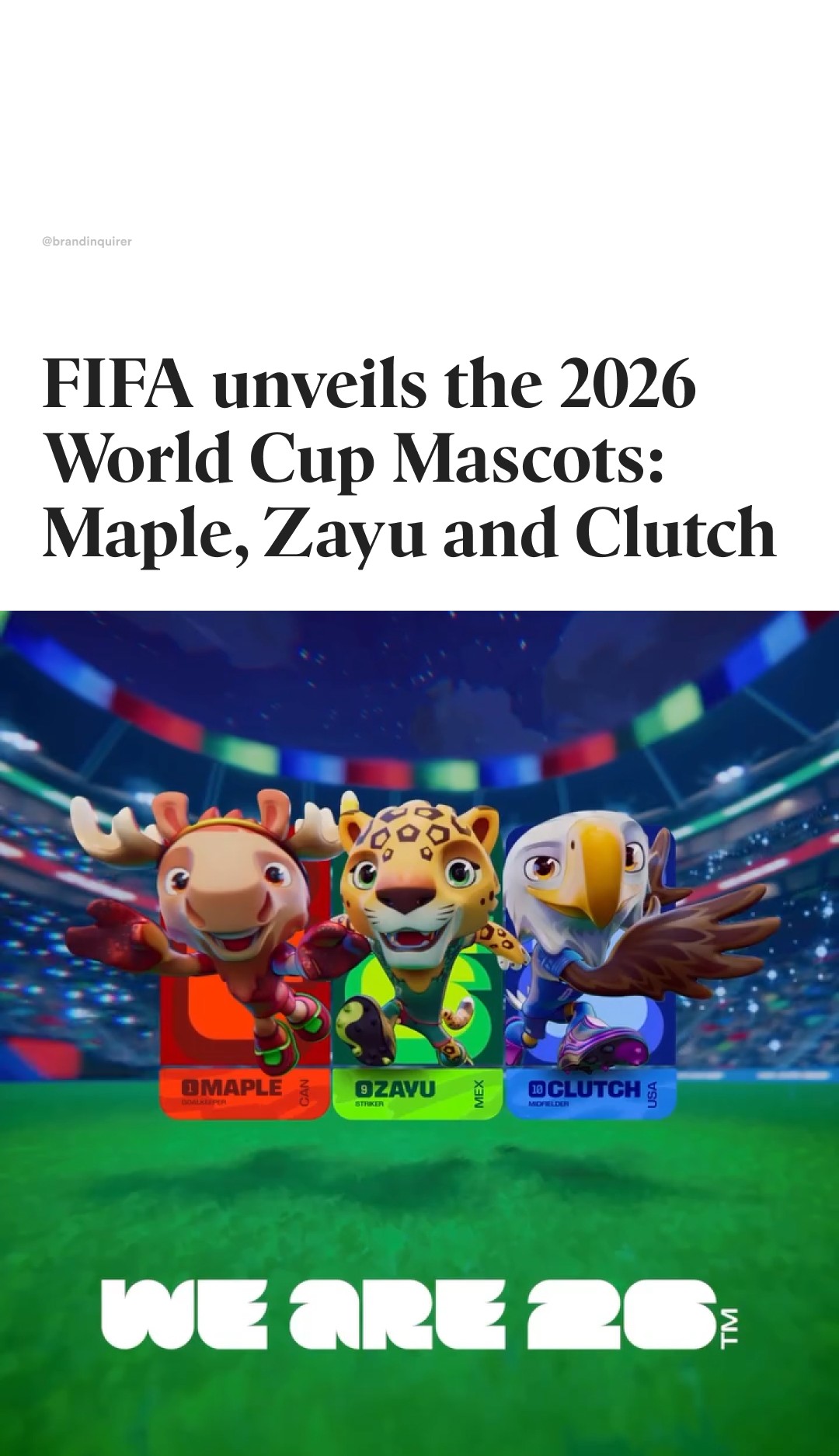
Are you team Moose, Jaguar or Eagle?
@fifaworldcup has unveiled the official mascots of the 2026 world cup! 🇨🇦 Maple the Moose, 🇲🇽 Zayu the Jaguar, and 🇺🇸 Clutch the Bald Eagle.
Each mascot represents an iconic animal from its country and has been thoughtfully designed to reflect the vibrant culture, heritage, and spirit of Canada, Mexico, and the United States.
🇨🇦 Maple the Moose – The moose is one of Canada’s most recognizable animals, and the name “Maple” ties directly to the maple leaf, a core national symbol.
🇲🇽 Zayu the Jaguar – Jaguars are native to Mexico and hold deep cultural significance in ancient Aztec and Mayan civilizations.
🇺🇸 Clutch the Bald Eagle – The bald eagle is the national bird of the United States and a powerful symbol of freedom and pride.
For the first time ever, Maple, Zayu, and Clutch will also be playable in the brand-new football video game @FIFA Heroes, launching next year and developed by @enverstudio
#FootballUnitesTheWorld #fifa #FIFAWorldCup #branding #brandidentity #logodesign #graphicdesign #creativedirection #brandstrategy #branddesign #designinspiration #brandinspo #graphicdesigner #football #mascot #characterdesign #illustration
1.66M
66.2K
154
5mo ago
brandinquirer
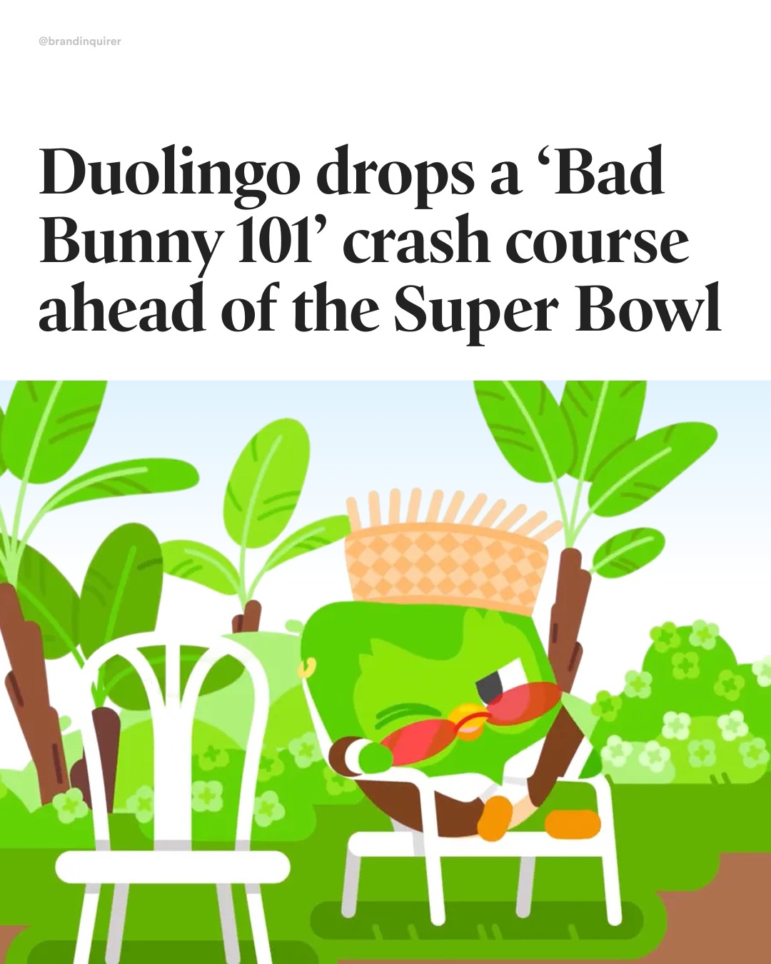
¿Listo para aprender?
@duolingo, known for its irreverent marketing and advertising strategies, is helping English-only speakers learn basic Bad Bunny Spanish ahead of the Super Bowl.
In a 15-second video shared on its social platforms and aired on TV, Duo dresses as Bad Bunny and introduces terms like “Perreo“ and “Tití Me Preguntó,” translating them into plain English.
While Duolingo won’t run an ad during the game itself, its pre-game TV campaign is supported by a social media countdown, and audio placements on music platforms.
#SuperBowl #SuperBowlAds #BadBunny #Halftimeshow #branding #marketing #graphicdesign #duolingo #spanish #puertorico #design
1.08M
43.3K
334
11mo ago
brandinquirer
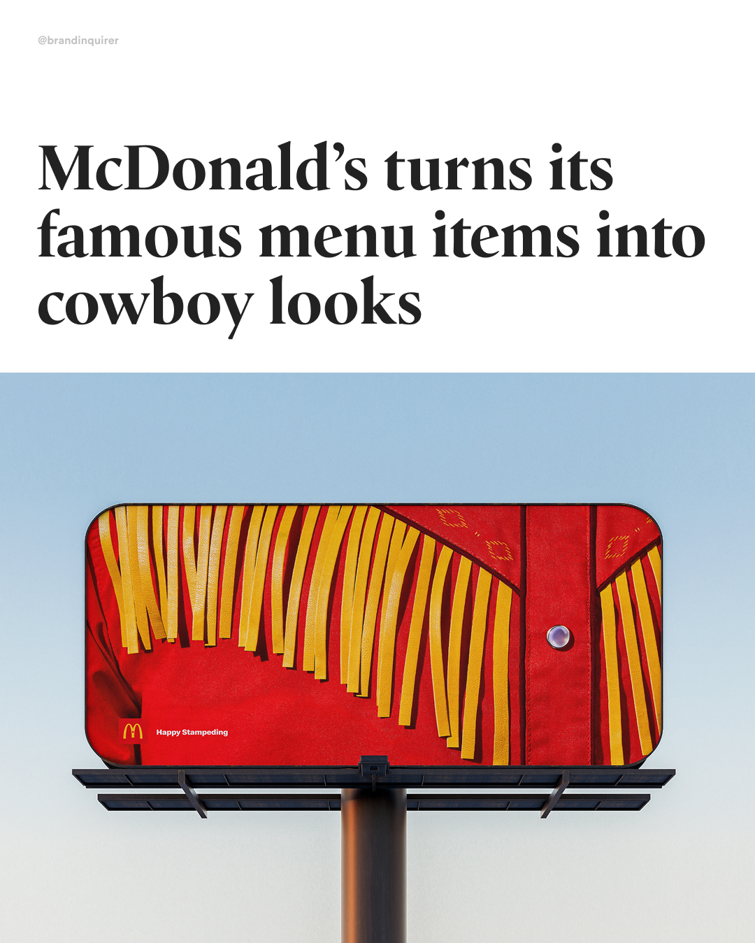
Do you see it?
For this year’s Calgary Stampede, @mcdonaldscanada had launched a campaign by marketing agency @cossette.en named 'Cowboy Closeups.
The campaign that hides Big Macs, Fries, and Vanilla Cones in close-up shots of classic Western wear.
The Calgary Stampede is a 10-day celebration of Western culture, rodeo, and community spirit—aka “The Greatest Outdoor Show on Earth.”
The brand has long-standing roots in Canadian agriculture, sourcing 100% Canadian beef, potatoes, and dairy, while supporting rural economies through local franchisees and agricultural programs.
I gotta confess I thought this was for the Cowboy Carter Tour 😭
#branding #brandidentity #logodesign #graphicdesign #creativedirection #brandstrategy #logoinspiration #visualidentity #branddesign #logotype #typography #designinspiration #brandinspo #graphicdesigner #mcdonalds
841K
55.6K
252
3mo ago
brandinquirer
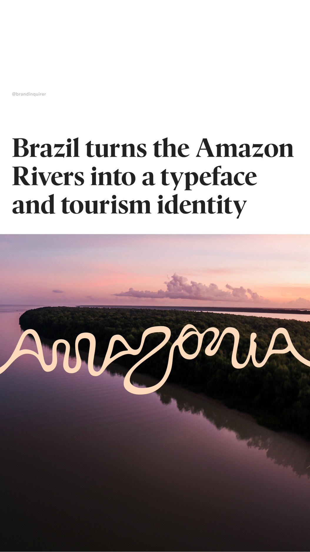
Best design of the year?
Brazil and @futurebrandsp have created a new brand to promote the Brazilian Amazon as a tourism destination across its nine states, highlighting one of the largest biomes on Earth.
The identity is built using real geographic coordinates, with each letter of the alphabet derived from satellite images of the Amazon River and its tributaries, forming a logotype shaped by the region’s navigable waters (Refined by @naipefoundry)
The system was co-created with artists from all nine states, bringing together illustration, photography, and audiovisual work to reflect the cultural diversity of a territory larger than India.
Artists:
Cristo: @_____cristo
Winy Tapajós @winnytapajos
Malu Menezes @maluanezes
Beatriz Belo @beademilho
Odir Abreu @pintor_odir
Ori Junior @ori.junior
Bob Menezes @bobmenezes_
Marahu Filmes @marahufilmes
Rogerio Pedro @rogeriopedroart
The initiative aims to encourage exploration of the region by supporting local activity across tourism, gastronomy, agriculture, arts, dance, crafts, and music.
#typograhy #font #graphicdesign #branding #typeface #lettering #designinspiration #design #brazil #amazonia #amazonriver #amazonrainforest
734K
29.4K
402
1w ago
brandinquirer
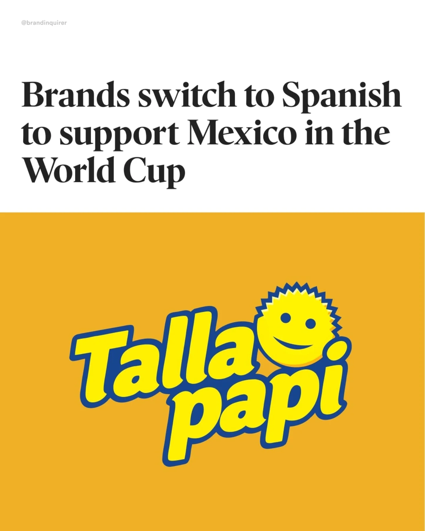
Mexico lost, but brands won?
Ahead of the Mexico vs. England World Cup match, brands across Mexico switched their names on social media to Spanish as part of the viral "Operativo No Inglés" trend — a playful response to facing an English-speaking opponent.
Companies including Scrub Daddy, Uber Eats, Tim Hortons, and 7-Eleven joined the movement to rally behind the Mexican National Team, turning language into a cultural expression of support.
Addressing the elephant in the room, yes, I scheduled this before Mexico’s loss, but it’s still a great example of a social media campaign done right.
#mexico #england #mexicovsengland #worldcup #football #branding #logodesign #brandidentity
697K
42.6K
373
5mo ago
brandinquirer
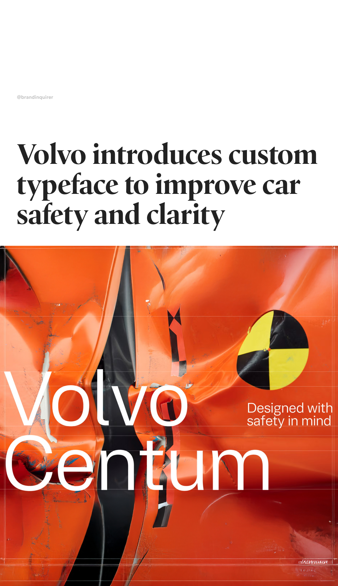
Can I typeface be safe?
@volvocars is answering that question with its new custom typeface, Volvo Centum.
In collaboration with world-leading type studio @dalton.maag, they have created a bespoke typeface designed to make reading faster, attention sharper, and the driving experience calmer.
Every curve, every terminal, every spacing decision was engineered to reduce visual noise and let drivers focus on what matters – safety, clarity, simplicity.
Volvo Centum supports over 800 languages – including complex scripts such as Chinese, Arabic, Japanese, and Korean – with optimized performance for both in-car interfaces and other applications.
The typeface will make its debut in the upcoming Volvo EX60
#typograhy #font #graphicdesign #branding #typeface #lettering #designinspiration #design #volvo
667K
26.7K
664
9mo ago
brandinquirer
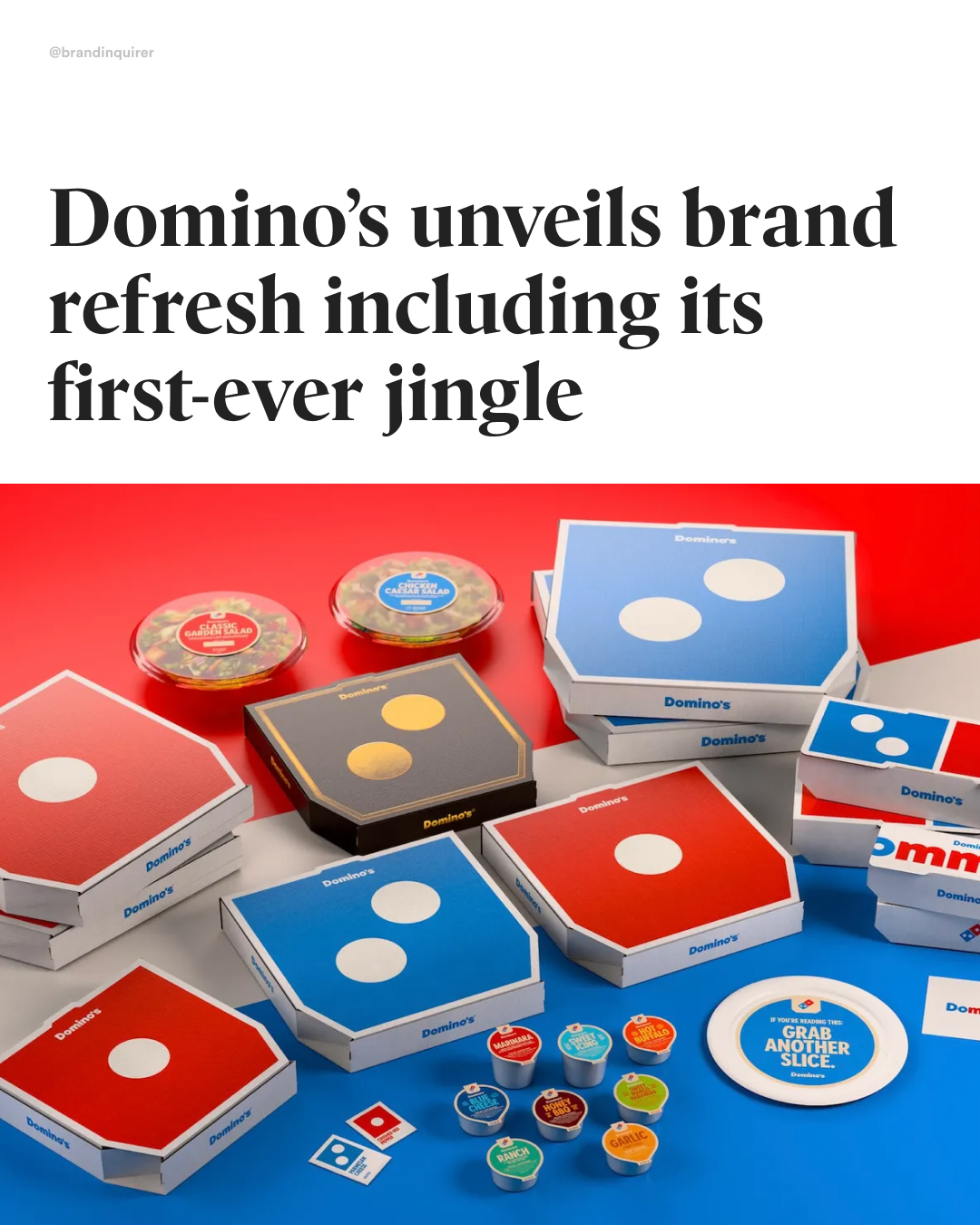
Mmm? Yes, indeed 🍕
@dominos is launching its first brand refresh in 13 years, aiming to connect with the next generation of pizza lovers.
Created by @wip_bdr, the refresh introduces a new logo with a brighter color palette and a bolder custom typeface, Domino’s Sans, with perfect circles and sharp edges that nod to pizza and pizza boxes.
The agency redesigned every touchpoint: from packaging that puts the logo directly in customers’ hands, to new employee uniforms, pizza boxes, and updated restaurant signage.
Domino’s signature Handmade Pan and Parmesan Stuffed Crust boxes now feature a premium black-and-metallic-gold finish.
And for the first time ever, the brand debuts a new jingle and logo animation, called Cravemark, brought to life by five-time GRAMMY-nominated singer-songwriter Shaboozey.
#branding #brandidentity #logodesign #graphicdesign #creativedirection #brandstrategy #logoinspiration #visualidentity #branddesign #logotype #typography #designinspiration #brandinspo #graphicdesigner #dominos #pizza
617K
24.7K
174
2mo ago
brandinquirer
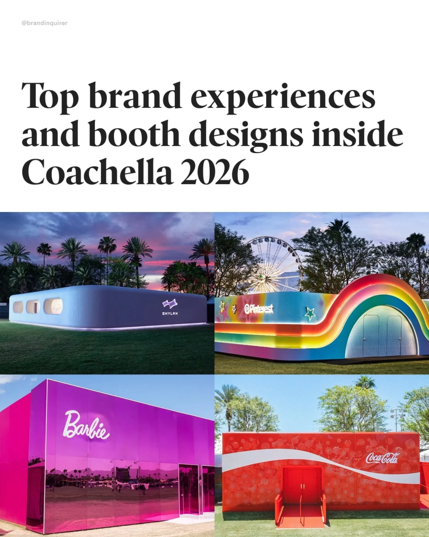
Coachella, the brands’ festival?
Coachella has grown over the years from an indie music festival into a cultural powerhouse—bringing together celebrities, musicians, and, of course, brands looking to connect with audiences through one-of-a-kind experiences. This year was no exception, with food, beauty, and fashion leading the way.
Brands like @always_brand @secretdeodorant @methodproducts @neutrogena @wavytalkofficial @medicube_global_official and @elfcosmetics created a haven for beauty, quick makeup retouches, and grooming.
Clothing brands like @gap and @skylrk dropped exclusive Coachella merch, while @pinterest @americanexpress and @barbie joined in with DIY and customizable accessories to complete the look.
Food and drink brands like @magnumicecream @cocacola @electrolit @heineken_us @starbucks and @aperolspritzofficial gave attendees a way to refresh with drinks and special menus, all combined with music and photo ops.
And this is just the tip of the iceberg—I’m only listing the brands inside the festival, but many others take advantage of the moment with their own private parties and influencer events.
Agencies are tagged on their respective photos
PS Waiting for my invite for next year 😉
#branding #coachella #coachella2026 #brandexperience #brandactivation #experientialmarketing #visualidentity #designinspiration #boothdesign #musicfestival #musicfestival
609K
53.7K
217
7mo ago
brandinquirer
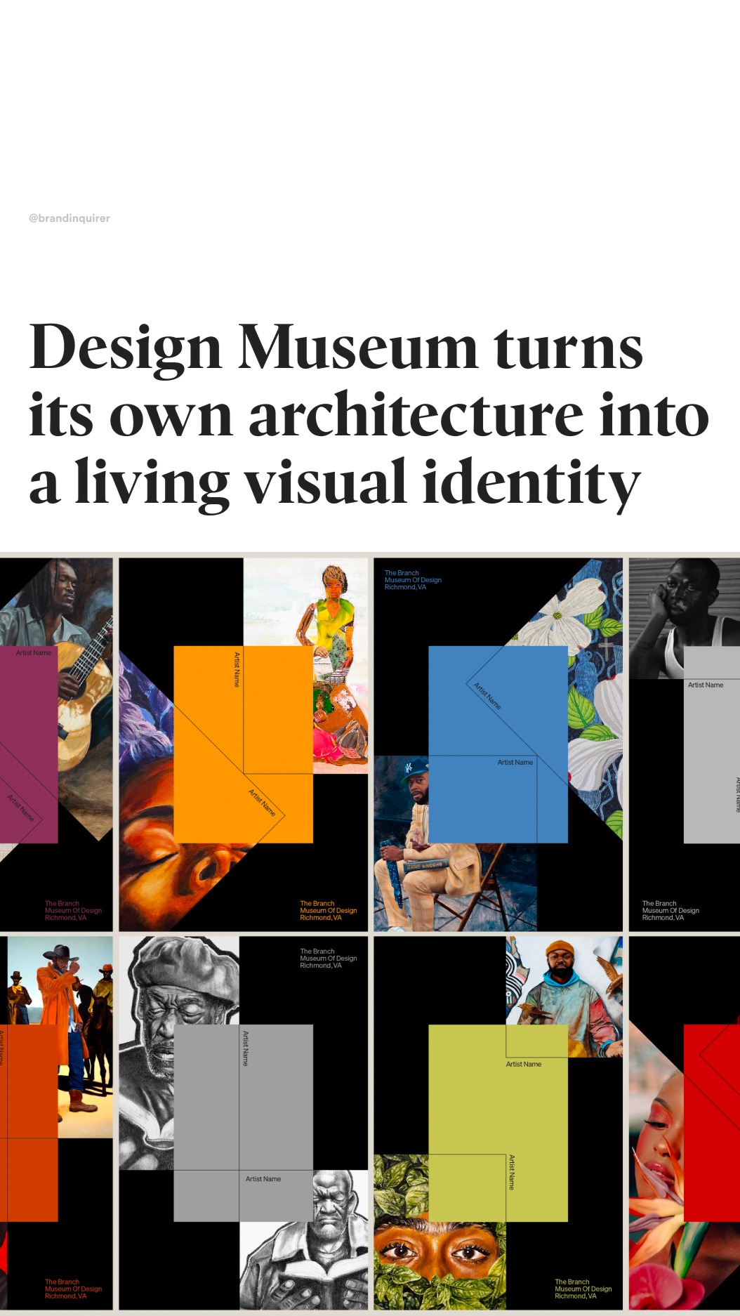
Museum worthy 😍
@branchmuseumofdesign has launched its first-ever visual identity system.
The new design system follows the museum’s name and direction shift from The Branch Museum of Architecture and Design to The Branch Museum of Design.
The visual identity, crafted by @mullenloweus, draws from the museum’s 1919 Tudor blueprints.
Its sculptural “B” logo, formed from three Tudor gables that evolve into literal “branches” throughout the system, becomes a physical expression of the museum’s mission to challenge ingrained viewpoints.
@evil_twin_musica extended the system through sound, mapping the roof’s original blueprint structure into the sonic branding featured in the film.
This repositioning establishes The Branch Museum as Virginia’s only design-dedicated institution — and one of roughly 20 in the U.S.
#Branding #LogoDesign #GraphicDesign #DesignInspiration #Branding #LogoInspo #BrandIdentity #typography #font #fontdesign #lettering #VisualIdentity #LogoLovers #audiodesign #museum #designmuseum
553K
22.1K
362
1mo ago
brandinquirer
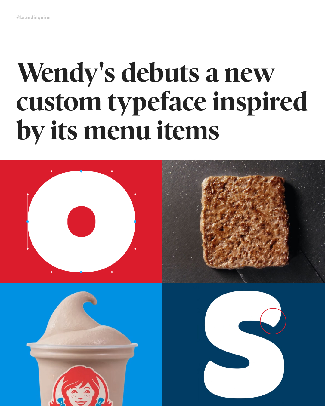
Do you want your type crispy or frosty? 🍟🍦
Type foundry @dalton.maag, in collaboration with agency @saatchix, has created a new flexible typeface for @wendys by adapting Objektiv, a clean geometric sans typeface, into a fresh, squared-off sans with subtle nods to brand heritage, square patties, and Frosty curves.
The system comes in two styles: Wendy’s Fresh, available in six weights and four widths, and Wendy’s Frosty, a softer, curvier display cut.
#typeface #typography #fontdesign #font #calligraphy #branding #graphicdesign #design
548K
21.9K
250
3mo ago
brandinquirer
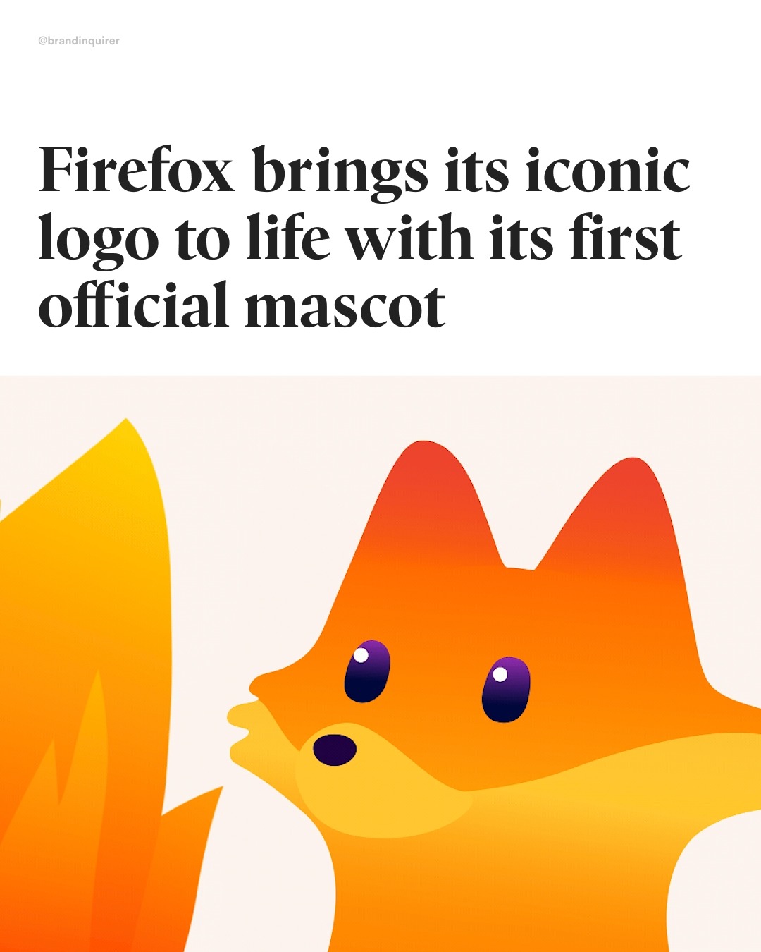
Watch out Lil Finder Guy?
@firefox has introduced its first official mascot, Kit, bringing its iconic logo to life. Created by @jkrglobal and illustrator @marcopalmieri_com, Kit is a friendly and familiar companion that makes Firefox’s support and commitment to safety visible as we enter a new internet era that is harder to trust.
Rather than interrupting the experience, Kit appears in subtle, encouraging moments, like when setting up features or completing small tasks, adding warmth and familiarity.
Defined as a “Firefox,” Kit is a unique creature that combines elements of a fox, a red panda, and fire, clarifying years of confusion around the brand’s iconic symbol.
The design relies on an expressive tail to convey motion and emotion, while personality is communicated through the eyes, posture, and body language instead of a mouth.
#Mozilla #Firefox #branding #graphicdesign #visualidentitydesign #characterdesign #mascot #mascotdesign #illustration #motiondesign #design #designinspiration #characterdesign #drawing
485K
19.4K
209
6mo ago
brandinquirer
A brand that values craftsmanship?
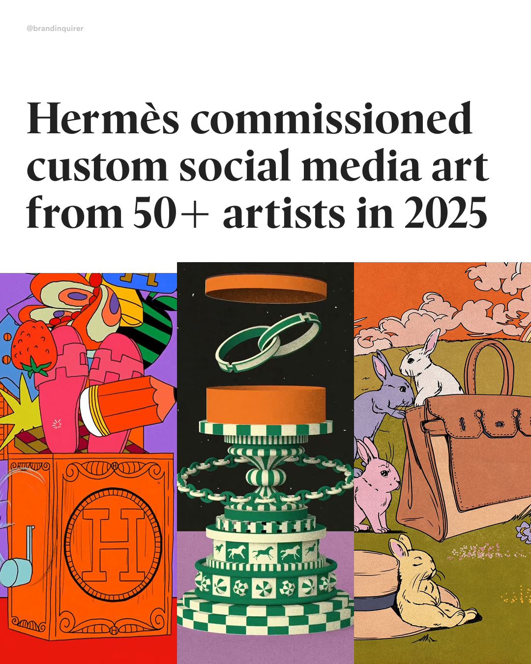
@hermes approaches social media the same way it approaches craft, slowly, intentionally, and with purpose.
Instead of chasing trends or pushing products, the French luxury house uses its platforms as a space to celebrate making.
In 2025 alone, Hermès collaborated with over 50 artists, musicians, and makers to create original content for its social channels.
Under the theme “Drawn to Craft,” the brand shares illustrations, stop-motion, sculpture, and sound-led pieces that all point back to one idea: everything begins with drawing, curiosity, and the act of making.
Each post becomes part of a larger narrative, reinforcing Hermès’ belief that craftsmanship isn’t static, it’s a living practice.
In a world dominated by trends, ephemeral content, and AI-generated visuals, Hermès shows what it looks like when a brand truly understands its history, purpose, and value in the modern era.
Artists in order of appearance: @angelakirkwood @anchoponcho @aroke.1 @federico_picci @kokooma_ @stefanocolferai @geoffroy_de_crecy @mr.boonstra @paulplow @henricampea
#branding #graphicdesign #creativedirection #brandstrategy #designinspiration #animation #graphicdesigner #illustration #marketing #hermes
482K
19.3K
114
7mo ago
brandinquirer
Gotta Design 'Em All?
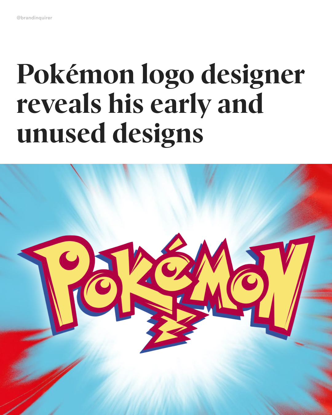
@chrismaple53, a Seattle-based designer, was commissioned in 1998 by Nintendo of America CEO Minoru Arakawa to create a logo, within one month, for their new video game, Pokémon, the Western adaptation of the Japanese hit Pocket Monsters.
Maple didn’t get any guidance beyond the requirement that the logo work on a GameBoy’s pixelated screen. He didn’t receive the games to play, but was given toys, illustrations of existing monsters, and an early Nintendo magazine.
Maple developed two final logo designs that were approved by Nintendo. One was released in 1998 and the other in 1999 with minor adjustments. Both crafted by hand and with the signature blue and yellow, likely inspired by the first Pokémon Blue and Yellow versions.
#branding #brandidentity #logodesign #graphicdesign #creativedirection #brandstrategy #logoinspiration #visualidentity #branddesign #logotype #typography #designinspiration #brandinspo #graphicdesigner #pokemon #pikachu
458K
18.3K
158
1mo ago
brandinquirer
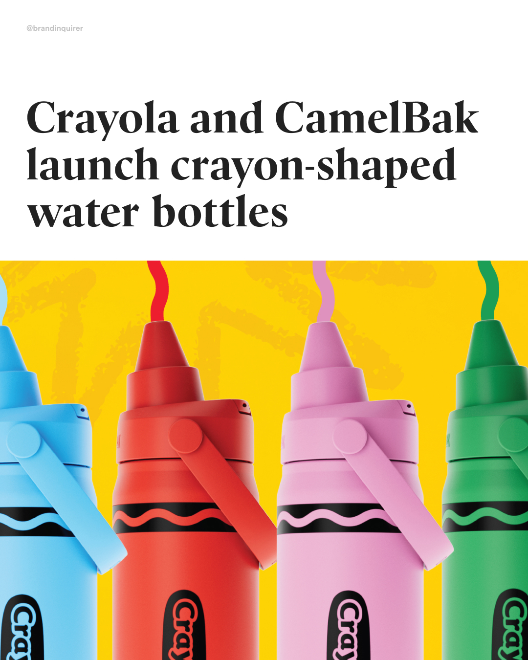
These are for adults, right? 🖍️
@camelbak and @crayola have partnered to launch a special edition collection of drinkware designs inspired by fan-favorite Crayola colors.
The colleciton includes insulated 16 oz options and lightweight, non-insulated bottles available in 14 oz and 25 oz sizes.
The bottles come in Sky Bue, Cherry Red, Yellow Orange, Mountain Meadow and Carnation Pink.
The collection is available on Amazon
#branding #crayola #drinkwear #waterbottle #design #productdesign #graphicdesign #design
456K
7.97K
120
8mo ago
brandinquirer
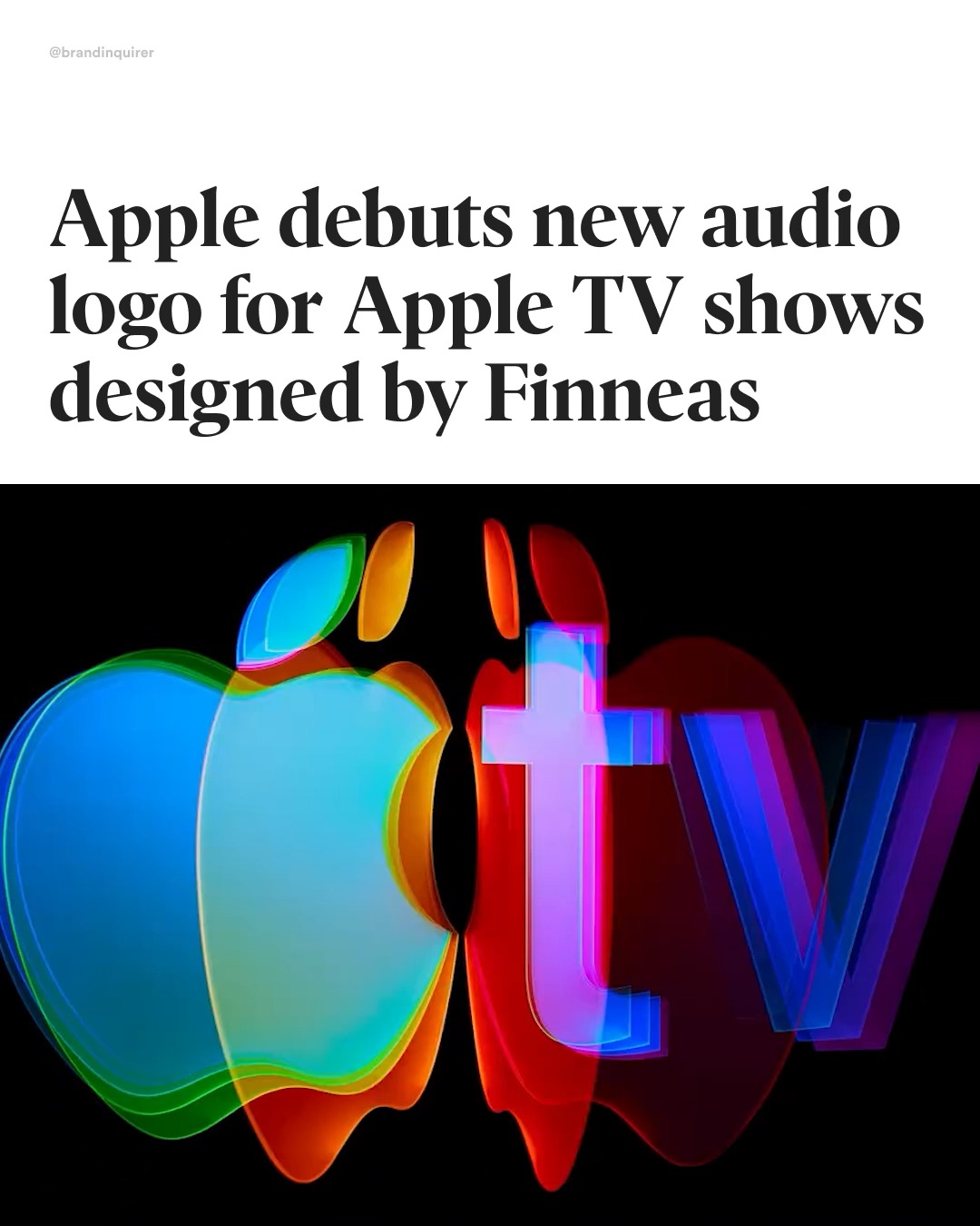
Catchy?
@apple has unveiled a new audio logo, or mnemonic, created by Grammy-winning artist and producer @finneas, which will precede all @appletv original shows and films going forward.
Finneas began at his upright piano,then built the sound by hitting pieces of zinc (and reversing the audio), reversing piano takes, and manipulating bass synths, pitching them up and gliding them down.
There are three versions of the mnemonic: a main five-second version that will play before TV episodes, a one-second version for movie trailers, and a twelve-second version designed for theaters, appearing before Apple Studios’ original films.
The new audio logo is part of Apple's revamp of Apple TV which started by removing the plus sign from its name earlier this year.
#branding #brandidentity #logodesign #graphicdesign #creativedirection #brandstrategy #logoinspiration #visualidentity #branddesign #logotype #typography #designinspiration #brandinspo #graphicdesigner #apple #appletv #appletvplus #finneas #audiologo #sounddesign
436K
17.4K
2.86K
9mo ago
brandinquirer
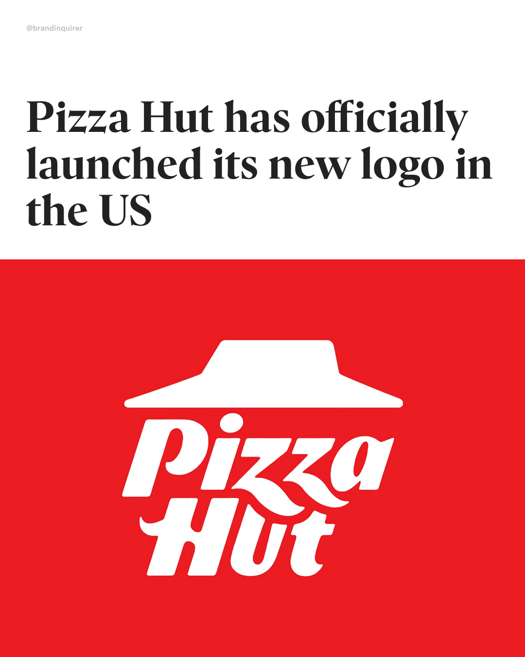
If it ain’t broke, why fix it?
After testing its new logo in international markets like Canada, the UK, and Australia, @pizzahut is officially rolling it out in the US, starting with its social media profiles.
The refreshed mark is an all-red, slanted version of the classic 1974 design (revived in 2019), with subtle tweaks like rounded hut corners, the “ZZ” overlapping the “U” and “T,” and sharper ends throughout.
Over the years, Pizza Hut has gone through 10 logo iterations, but for many, the 1974 design still reigns supreme (pun intended).
#branding #brandidentity #logodesign #graphicdesign #creativedirection #brandstrategy #logoinspiration #visualidentity #branddesign #logotype #typography #designinspiration #brandinspo #graphicdesigner #pizzahut
396K
15.8K
138
1mo ago
brandinquirer
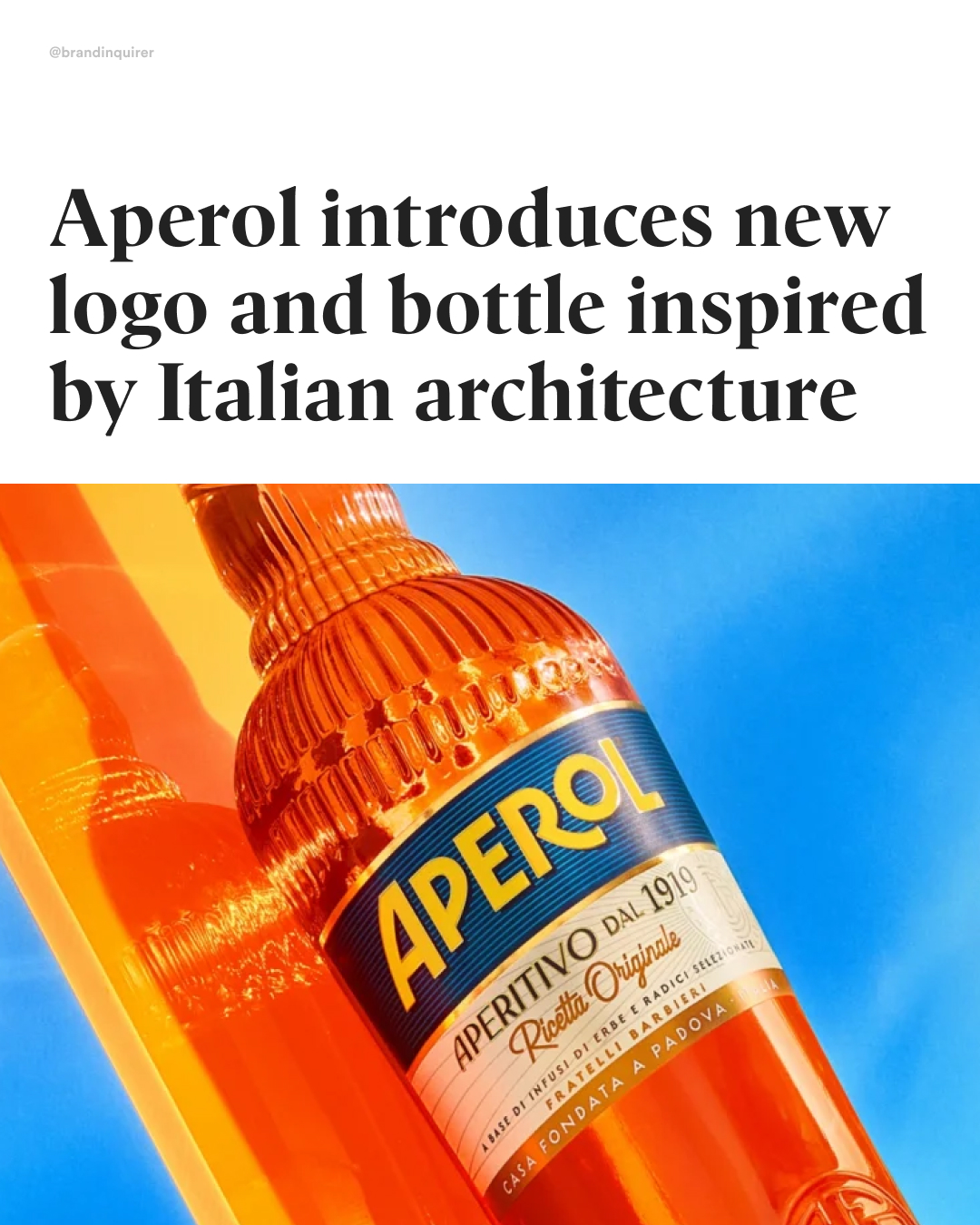
How do you bottle Italian tradition?
Aperol has partnered with @design_bridge to evolve its packaging and identity, honoring more than a century of Italian tradition.
The new identity features a redrawn logotype and a new monogram of Aperol’s founders, the Barbieri brothers—both designed by lettering artist @alec_tear.
The redesigned bottle reflects the brand’s Italian roots through tactile details: a double-embossed shoulder inspired by Santa Maria della Salute, rippled glass evoking Venetian canals and Murano artistry, and the embossed monogram that serves as a seal of quality and craftsmanship.
#packagingdesign #branding #logotype #graphicdesign #logodesign #italy #aperolspritz
The Brand Inquirer (@brandinquirer) Instagram Stats & Analytics
The Brand Inquirer (@brandinquirer) has 107K Instagram followers with a 5.54% engagement rate over the past 12 months. Across 149 posts, The Brand Inquirer received 1.56M total likes and 12.9M impressions, averaging 10.5K likes per post. This page tracks The Brand Inquirer's performance metrics, top content, and engagement trends — updated daily.
The Brand Inquirer (@brandinquirer) Instagram Analytics FAQ
How many Instagram followers does The Brand Inquirer have?+
The Brand Inquirer (@brandinquirer) has 107K Instagram followers as of July 2026.
What is The Brand Inquirer's Instagram engagement rate?+
The Brand Inquirer's Instagram engagement rate is 5.54% over the last 12 months, based on 149 posts.
How many likes does The Brand Inquirer get on Instagram?+
The Brand Inquirer received 1.56M total likes across 149 posts in the last 12 months, averaging 10.5K likes per post.
How many Instagram impressions does The Brand Inquirer get?+
The Brand Inquirer's Instagram content generated 12.9M total impressions over the last 12 months.