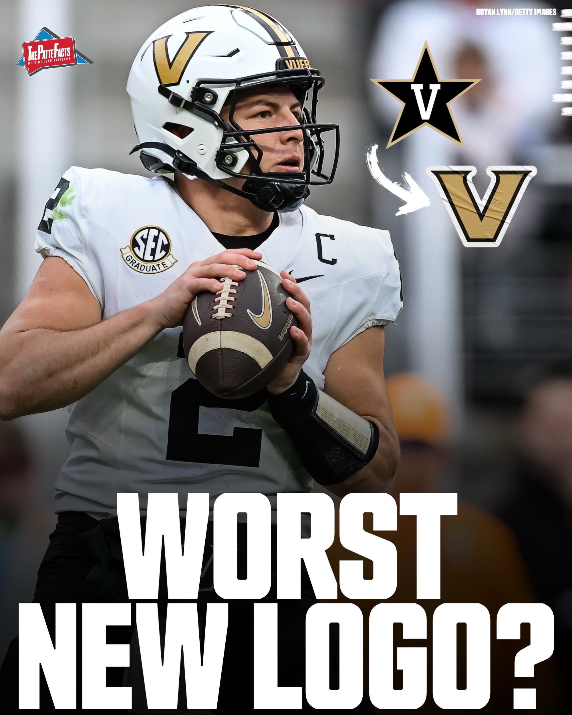
Vanderbilt Football is one of many teams that has changed their logo, but was it for the better? 🤔
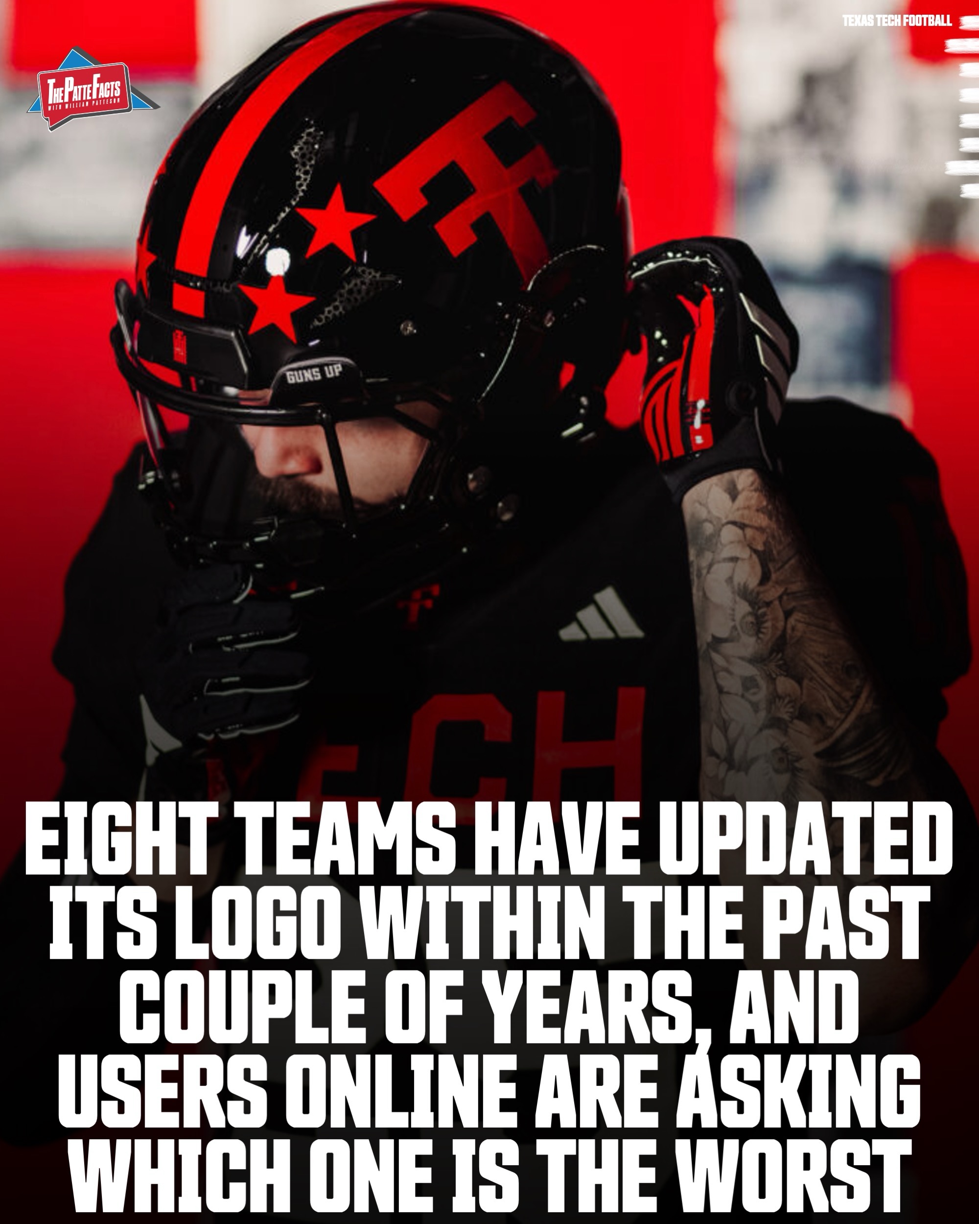
Eight teams in college football have updated its logo within the past couple of years, and users online are asking which change is the worst.
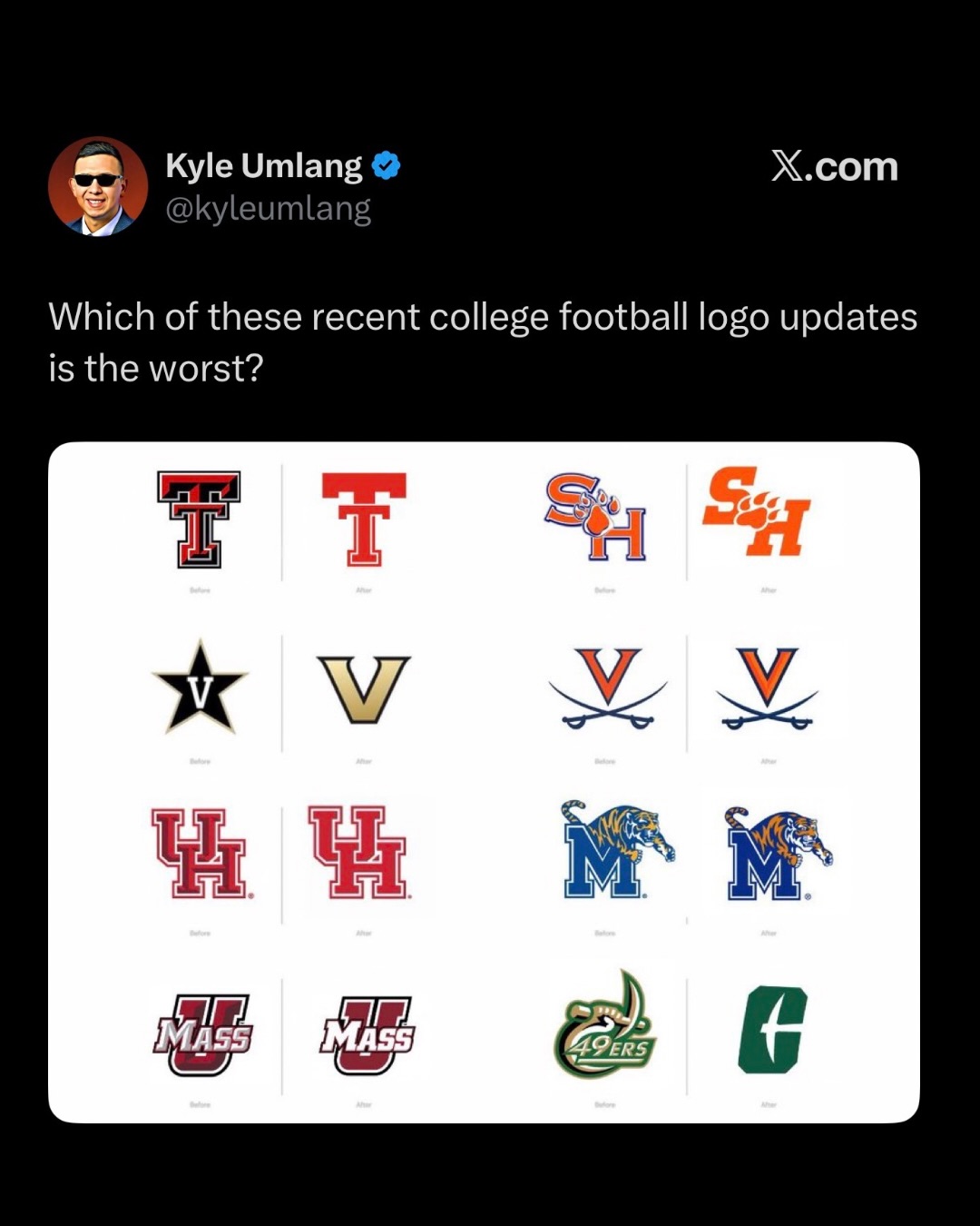
Three teams have made noticeable logo changes, while some have been more subtle.
Texas Tech simplified its “Double T” logo for the 2026 season as part of a broader athletic brand refresh heading into the football season.
Vanderbilt replaced its longtime star logo with the standalone “V” in 2022 during a full athletics rebrand.
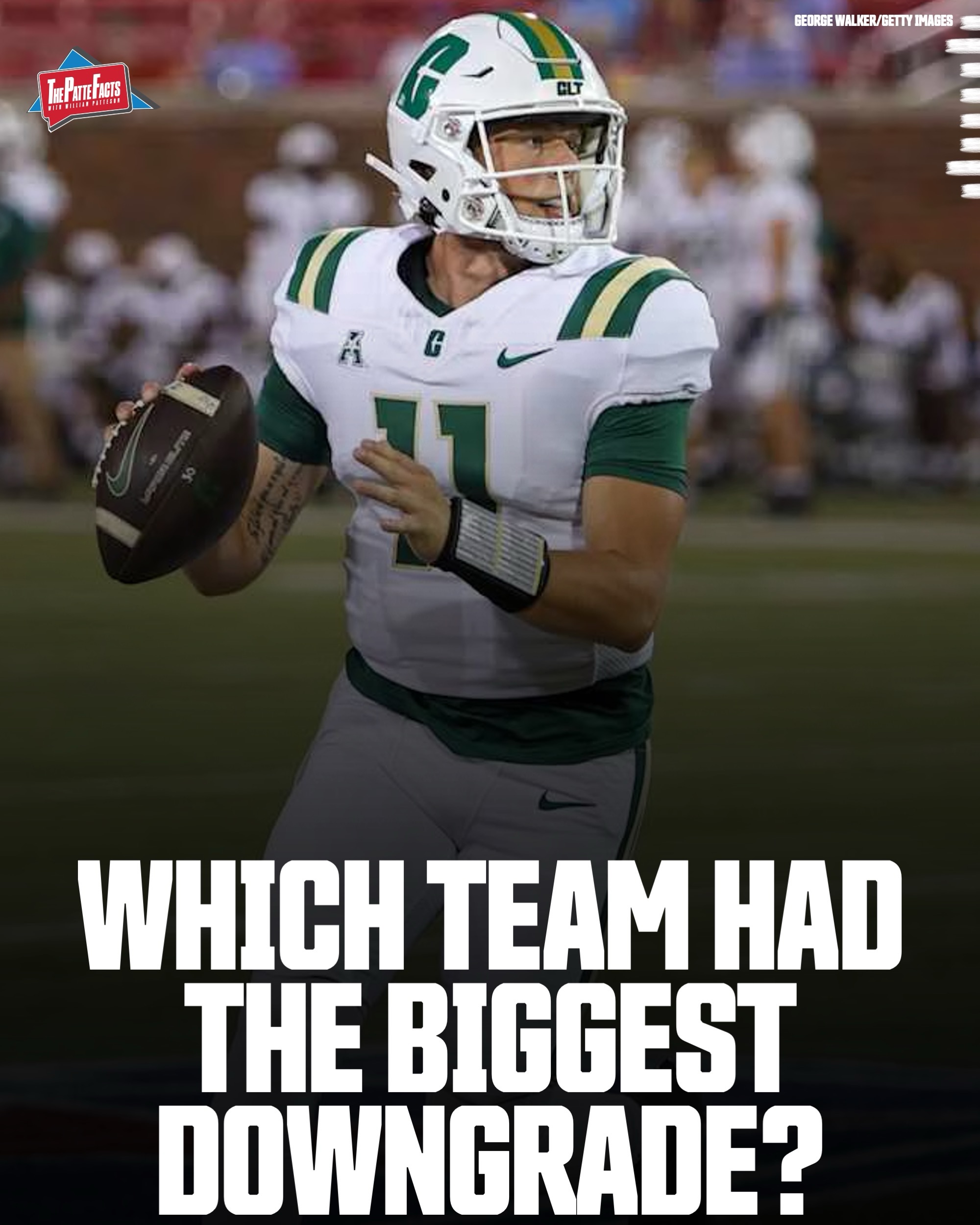
Charlotte unveiled a completely new “pickaxe” primary logo in July 2020 to modernize the athletic department’s branding.
The more subtle changes are almost like the schools wanted to recreate the “all he did was take a step back” meme, but are still worth noting.
Sam Houston updated its SH paw logo in April 2023 shortly before transitioning into Conference USA and the FBS level.
Virginia made a minor update to its crossed-sabres logo in 2020 by sharpening the lines and adjusting proportions.
Houston subtly modified its interlocking UH logo in 2023 with cleaner outlines and spacing adjustments.
Memphis refreshed its tiger-and-M logo in May 2021 to create a more modern and aggressive look.
UMass adjusted its block UMass logo in 2022 with updated beveling and cleaner typography.
Logo changes in 2026, for any brand identify, have pushed towards more modern styles and all of these fit that bill.
Granted, some changes are more dramatic than others.
Which team had the biggest logo downgrade?🤔
Photo attribution on slides.
#collegefootball #cfb #cfb26 #cfb25
Vanderbilt Football is one of many teams that has changed their logo, but was it for the better? 🤔
Eight teams in college football have updated its logo within the past couple of years, and users online are asking which change is the worst.
Three teams have made noticeable logo changes, while some have been more subtle.
Texas Tech simplified its “Double T” logo for the 2026 season as part of a broader athletic brand refresh heading into the football season.
Vanderbilt replaced its longtime star logo with the standalone “V” in 2022 during a full athletics rebrand.
Charlotte unveiled a completely new “pickaxe” primary logo in July 2020 to modernize the athletic department’s branding.
The more subtle changes are almost like the schools wanted to recreate the “all he did was take a step back” meme, but are still worth noting.
Sam Houston updated its SH paw logo in April 2023 shortly before transitioning into Conference USA and the FBS level.
Virginia made a minor update to its crossed-sabres logo in 2020 by sharpening the lines and adjusting proportions.
Houston subtly modified its interlocking UH logo in 2023 with cleaner outlines and spacing adjustments.
Memphis refreshed its tiger-and-M logo in May 2021 to create a more modern and aggressive look.
UMass adjusted its block UMass logo in 2022 with updated beveling and cleaner typography.
Logo changes in 2026, for any brand identify, have pushed towards more modern styles and all of these fit that bill.
Granted, some changes are more dramatic than others.
Which team had the biggest logo downgrade?🤔
Photo attribution on slides.
#collegefootball #cfb #cfb26 #cfb25